How Headings and Landmarks Help Accessibility

Setting in place a solid page structure and design for any site or app is key for building an accessible experience. Page structure consists of headings and landmark elements which help screen reader users understand the layout and content of the page at a high-level.
Headings
When we speak about a "heading" we refer to the larger bits of text which denote a new section of content the page often found within body copy, not the "header" of the site, which typically consists of the logo and navigation, etc.
People who depend on assistive technology often navigate by headings first.
It's important that the code making up the heading structure is linear and is in a logical order. When someone who depends on assistive technology visits a new site or page that they've never been to before, they'll often first navigate by headings to get a sense of the content being offered on the page.
The menu analogy
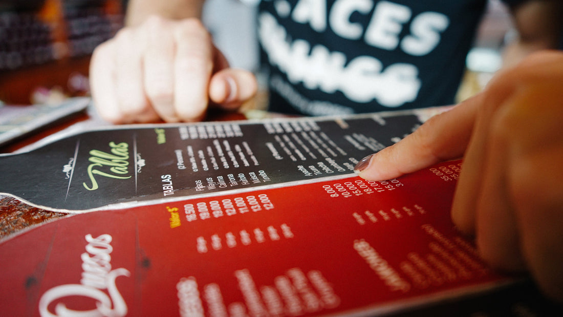
Here's one way to think about heading levels. Imagine you're at a new restaurant for the first time. Someone may show you to your table, you take your seat, and grab a menu. Now, think about how you might try to narrow down what you'd like to have.
- First, the cover of the menu might have the name of the restaurant. This is confirmation that you're at the right place and you're ready to dive in to the menu. The restaurant name could be thought of a heading level 1 (
h1), the primary theme of the page. Great, let’s continue. - Next, you review the categories of meals available on the menu: appetizers, salads, sandwiches, burgers, pizza, kids menu, etc. The category titles could be considered heading level 2 (
h2) since they represent a major section of content on the menu. - Feeling hungry, you dive into the pizza category. Plain cheese, pepperoni, veggie, meat lovers, Hawaiian (yes please). These represent items available within the pizza category. Therefore, each item title could be considered a heading level 3 (
h3). Content describing the pizza would be plain text underneath this heading.
When the last pizza item is read and you decide to check out what's under the seafood category instead, this would lead us back up to "Seafood," heading level 2 (h2), drilling down into its items (h3) and so on until you make your delicious choice!
In the same manner as someone navigating their way through a menu, screen reader users also navigate web pages they've never been to before. Heading navigation is one method available to quickly gain an understanding of what's on the page and decide to return to a section of interest or move ahead.
Logical heading order is key
In your HTML you'd start with a single h1 heading as the primary title of the page, followed by an h2 heading for each major sub-section of content. If there were any sub-sub-sections, those would feature h3 headings, and so on. When a section of content is complete, the heading would return to the appropriate previous level to start the new section.
<h1>Primary heading</h1>
<!-- ... -->
<h2>Section</h2>
<!-- ... -->
<h3>Sub-section</h3>
<!-- ... -->
<h2>Section</h2>
In addition to the HTML code conveying semantic meaning behind the headings, the visual design of headings is also very important. Text sizes which go from large to medium to small visually denote the content structure and related content. People with a cognitive impairment or reading/learning disability will greatly appreciate content being split into pieces with headings conveying the message, "this is a new section of content."
Without headings, large walls of content can be quite difficult for some people to consume and may even lead to a sense of overwhelm.
Examples
Check out these examples. Notice the increased readability and understanding of the text as the headings are added to the document. Additionally, when HTML headings are used properly, screen reader users are able to gain a better understanding of the page structure.
WCAG success criteria
This comes back to 2.4.6 Headings and Labels which states:
"Headings and labels describe topic or purpose."
Landmarks
Landmarks are the HTML elements which define the overall structure of a complete page. A typical web page might include sections such as a top bar with a heading logo, main navigation, a sidebar with more navigation or additional related content, a footer section, and of course the main body content.
As a result, what we now have with HTML5 are specific elements which feature the semantic meaning for each section.
At a high level, the landmark elements consist of:
| Element | Role | Notes |
|---|---|---|
header |
banner |
Typically the first landmark element in the DOM, containing the main logo, primary navigation, and sometimes a search form. |
footer |
contentinfo |
Typically the last element in the DOM, containing links and copyright information. |
aside |
complimentary |
Contains content relative to the article or the site in general. |
nav |
navigation |
Used to denote navigation areas. |
main |
main |
The main content area of the page, typically found as a sibling to the header and footer. |
section |
The only landmark without an explicit role value, is a generic element used for sectioning off content such as portions of a page or article. |
Just like with headings, people who use a screen reader are able to discover page content by navigating via landmark elements exclusively. This allows people to quickly jump to different sections of the page without having to wade through content unrelated to their current task.
As a result, it's critical to understand and know how to use both headings and landmarks in a way that is useful and helpful for people who rely on assistive technology.
