Next Level Accessibility: 5 Ways I Made the freeCodeCamp Guide More Usable for People with Disabilities

I spent the majority of Hacktoberfest 2017 working with some great folks over at freeCodeCamp. My focus was specifically on helping to bring the accessibility of their Guide site to the next-level.
The first time I saw the site I knew it would be a fantastic resource for lots of people out there, so I took on the challenge to help ensure its usability was top notch for everyone!
Working on the site was also a lot of fun as it's built with React, so this brought a few extra coding challenges along the way.
Let's check out the 5 issues that I found and how I addressed them, together!
Accessibility Improvement #1: Skip navigation link unavailable
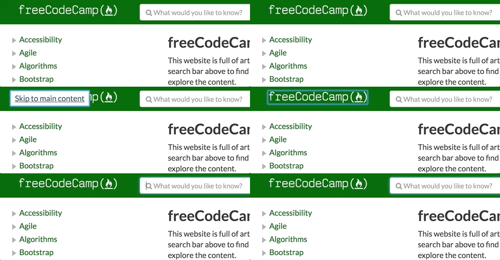
One of the first things I check for on a site is if there's a skip navigation link available. Skip navigation links are a small but handy feature for any site to have for keyboard-only or screen reader users. Why?
The problem
Without a skip navigation link, people using just the keyboard to navigate would need to Tab through each link in the sidebar every time the page reloads. Since there's a lot links available, navigating through this section would be cumbersome.
The Solution
Implementing a skip navigation link is quite simple. It's usually the first item in the DOM (Document Object Model) and on click, keyboard focus is sent to the page element which contains the primary content of the page.
The link I added was coded as:
<a className="skip-link sr-only sr-only-focusable" href="#main">
  Skip to main content
</a>
The #main value in the href attribute sends the keyboard focus to the page element which features the id="main" attribute.
In order for this page element to receive keyboard focus, I needed to add a tabindex attribute to the container:
<main className="main" id="main" tabIndex="-1">
  { props.children() }
</main>
Adding the tabindex value of -1 allows a non-focusable element to programatically receive focus, but is left out of the natural tab order.
The result
With the skip navigation in place, people using a keyboard can skip repeated regions like the side navigation area to easily reach the main content section.

Check out the full code change in the PR (Pull Request): Added skip link #4175.
Accessibility Improvement #2: Search field missing label
I noticed the search input field was missing a label. Having an associated label for each form input is key to a successful user experience. Why?
The problem
When input fields are missing a label, screen readers are unable to accurately describe what the intended purpose of the field is for. Imagine for a moment a link with no text; what does this link do?
The solution
This one was fairly straight-forward. Adding a label to an input is a matter of creating the label element with a for attribute, then associating it with an input with an id.
In order to not disrupt the current design of the site, I also added the srOnly prop to have the label be visually hidden.
The label was coded as:
<ControlLabel htmlFor="searchInput" srOnly={ true }>
  Search
</ControlLabel>
Then for the existing input control, I simply added the id='searchInput' prop.
The result
Now when screen reader users navigate to the Search field, they'll hear the label value of "search" and have more context of what is expected.

Check out the full code change in the PR: Search input a11y updates #4123.
Accessibility Improvement #3: Sidebar role adjustments
When inspecting the HTML source, I noticed some of the sidebar elements incorrectly featured role="presentation" attributes. I also noticed some elements were marked up as divs instead of appropriate, semantic markup. This needed some adjustment. Why?
The problem
Two issues existed with this section of the site:
- When you apply
role="presentation"onto an element, this removes all semantic meaning. In other words, when a screen reader encounters the element, there is no meaningful announcement to notify the user what the element is for. Imagine a link on a page, but its text is the same color as the content text and with no underline. How would you know it was a link? - The other issue here is when
divelements are used to markup meaningful structure. As you may know,divelements have no semantic meaning and are typically reserved to create structure on a page. In cases where they're used in place of natively semantic elements, you'd need to apply the appropriateroleattribute to convey this meaning.
The solution
- For each navigation list item and link, I simply removed the
roleprop in order to allow the semantic meaning to shine through for screen reader users. - For dynamic components which generated
divelements, I applied appropriateroleprops, includingrole="list"for thePanelGroupcomponent, androle="listitem"for any instances of thePanelcomponent.
The result
With the role props adjusted, screen reader users will hear clear and precise announcements when encountering these elements, including:
- Instances of the
Linkcomponent will be announced as a "link" element — very important, and; - The
PanelGroupandPanelcomponent items will be announced as a "list" element. As a result, the total number of items will also be announced, giving context of how many items are available on the journey ahead.

Check out the full code change in the PR: Side nav a11y updates #4093.
Accessibility Improvement #4: Search result availability not announced
As a sighted user, I was aware when a search was successful on account of the main content area changing its content to present a listing of items. But what about a blind, screen reader user?
The problem
If a screen reader user entered search text and pressed Enter, nothing would be announced indicating a successful search or any results. How's someone to know when items are available in order to move ahead and discover this new content?
The solution
In order for the current result count to be announced, I created a new, visually hidden, aria-live region. This region gets populated with new content when new search results are present.
The region is marked up using a div with a few extra attributes:
-
aria-live="polite"creates the "live" region and tells screen readers to wait until other processes are finished before announcing its content. -
aria-atomic="true"tells screen readers to announce all the text within the region, not just the changed text. -
role="status"sets the expectation for screen readers to interpret the live content as "advisory" information. In other words, it's pretty important, but not critical (as people could navigate forward and discover content on their own.)
Here's what the final code snippet looks like:
<div aria-atomic="true" aria-live="polite" className="sr-only" role="status">
  {`${results.length} result${results.length === 1 ? '' : 's'} found`}
</div>
Notice the use of the ES6 template literal to interpolate the content as well as execute a ternary conditional statement to adjust for a plural or singular state.
The result
Now with an active screen reader, after submitting a search term, the number of results will be announced by assistive technology: "20 results found!"

Check out the full code change in the PR: Search results announcements #5137.
Accessibility Improvement #5: Managing sidebar link focus
I noticed when navigating with a keyboard, after clicking a link to load page content, the focus indicator would stay on the current item. This was an issue. Why?
The problem
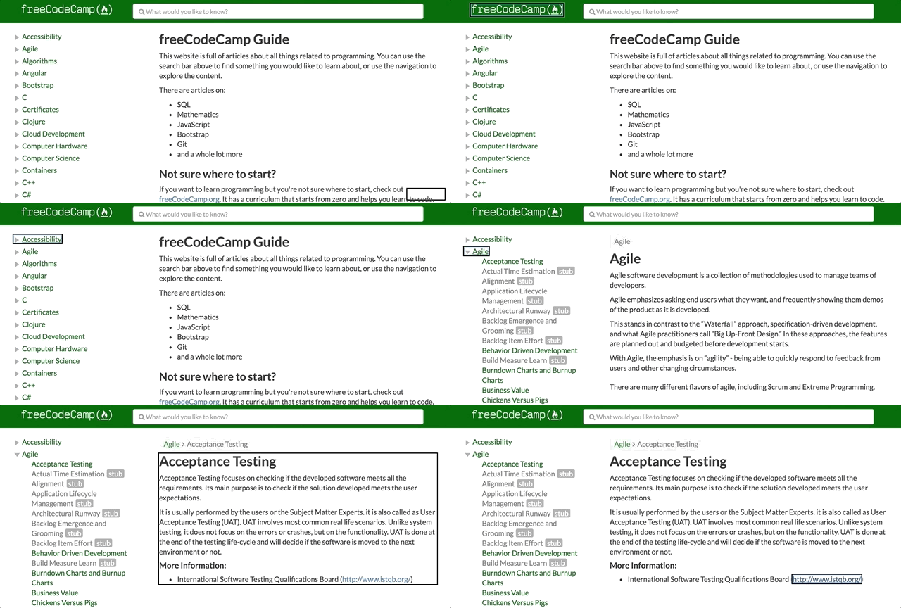
Without proper focus management, keyboard-only or screen reader users would have to navigate through the whole sidebar navigation to get to the page content. Not only this, there's also no audible announcement alerting the user something has taken place on the click() event.
The solution
The fix I ended up going with was a bit of a hack. Normally you would create a ref prop on the content container, then pass the ref object up and over to the component which generates the sidebar link elements, then set focus() on the container on click(). This was not a possible solution as a result of the site using something called Gatsby and there being an issue with passing objects to Link components? I'm not really sure of the issue, but it just didn't cooperate.
To get around this limitation, my solution went like this:
- I added a
data-navitem="true"attribute to each of the appropriate sidebarLinkcomponents. - On the
click()event, theArticlecomponent loads with the requested content, settingdocument.activeElementto the clicked link element. - Within the
Articlecomponent'scomponentWillMount()method, I check if the currently focused element (the sidebar link viadocument.activeElement)has thedata-navitemattribute. - If this condition is
true, shift keyboard focus to thearticleelement.
The Result
Now when someone using the keyboard activates one of the sub-navigation links from the sidebar, keyboard focus shifts to the article content container. And this also provides context to screen reader users, conveying that something has taken place on click().

Check out the full code change in the PR: NavItem focus #7818.
And there we have it! With these few adjustments, the accessibility and usability of the freeCodeCamp Guide site has increased quite a bit! People can more comfortably use the site with ease and success.
This is just a high-level outline of a few issue that I tackled, but I know there's more to do. Everyone on the freeCodeCamp Guide repo was very friendly and eager to help answer my newbie-ish React questions, so don't hesitate if you want to help out!
Happy hacking! 💻😄💖
