Listening to the Web, Part Two: It's All Semantics

- Part 1: thinking in accessibility
- Part 2: it's all semantics
- Part 3: working with screen readers
As designers and developers, at the end of the day, we do what we do because we want people to benefit. As we discussed in yesterday's post , it's essential that we consider the various ways others might be interacting with our sites. Are they sitting comfortably in their home on a laptop? Do they have an infant in one arm and a phone in the other? Are they in a rush trying to find information on the closest hospital? The fact of the matter is, we can't know.
We will never know when, why and, in some cases, how someone will interact with and consume the content we put out into the world. What we can do is realize this fact, embrace uncertainty, and try to create functional user interfaces for as many contexts as possible.
I believe one of the best ways to achieve this feat is to ensure accessibility is at the forefront of the design and development workflow.
Use semantic HTML
In my early days of working with the web, I heard the term "semantic HTML" and how it was the "correct" way to write HTML markup. Every time I heard that phrase, I really didn't understand what it meant. For a long time I thought the idea was to make sure you wrote valid HTML and tested its validity by running your source code through the W3C validator.
I know now that this is not the whole story.
Writing semantic HTML also means using native browser elements and controls in order to convey the meaning and purpose of the content. Understanding when and how to use HTML elements is not always easy, but correct implementation will result in a positive and successful user experience for people who depend on assistive technology.
There is information that needs to be present when an element receives keyboard focus in order for someone using a screen reader to navigate and consume that content. Focusable elements include links and form controls, and when the element is in focus, its text content and attributes are read out loud to screen reader users.
What is announced are a few important pieces of information:
- The element's accessible name or text equivalent
- The element role
- The current state of the element (if applicable)
What's in a name?
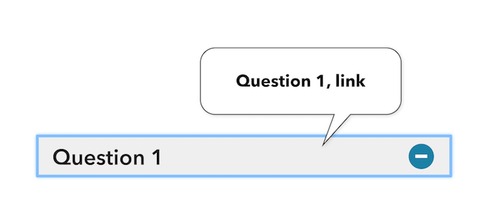
The accessible name is the part that describes what the element is for, its purpose for being. This is usually found as the content between the start and end tags of an HTML element. It could also be the alternative text value for an image. For example, an anchor element (better known as a link) has text between its start and end tag. This text gets read aloud with a screen reader which gives context on what should happen or where the browser should go when that link is activated.
For example, a link in a navigation area with the accessible name of "Contact Us" would indicate that, if you activated that link, it would load a page with contact information, maybe a telephone number or address, and possibly a form where someone could send a message to the company.
A critical role
The element role tells us a few things, including what the element does and how to interact with it. Coming back to the link example, the role announced would be "link," as links are structured with opening and closing <a> tags and a valid href attribute. The expected result or "what it does" would be the browser to either load a new page or jump to another section of the same page, shifting focus to a different page element.
Various element roles come with expectations on how to use them. Depending on the role, a user might expect they would need to press the Enter key to continue (as is the case with a link), use the Space key to activate a <button> , or use the up or down arrow keys to make a selection. A role can also signify a change of context, such as a modal window being presented on the screen.
What condition my condition is in
Alternatively, depending on the element at hand, there could be a state announced along with the element name and role information. Announcing the state helps to convey the current condition of the element, whether interaction is needed, and what might happen when the interaction takes place. For example, checkboxes and radio buttons have a "checked" or "unchecked," and a "selected" or "unselected" state, respectively. An accordion style widget would have an "expanded" or "collapsed" state, indicating whether the content is on-screen and available for consumption (expanded), or if the content section will merely be skipped over when navigation continues (collapsed).
The semantics of an element are very important to keep in mind when writing HTML. This is how people using screen readers will know how to navigate and consume your site content and what to expect when interacting with an element.
Keep an accessibility mindset
When planning a course of action for marking up a new site design or a module in a style guide, consider the visual aspect and potential interactions for each element. Ask yourself a few questions, such as:
- What is the design's purpose or intention?
- Which HTML element is best suited to meet the design requirements?
- How will the element handle keyboard interaction, and how will a screen reader announce the name, role, and state of the element?
- Is there a requirement to manage browser focus programmatically?
- Is the text content clear, easy to read, and understandable?
- Is there enough contrast to be able to read the text content?
If you feel any concerns when answering these questions, perhaps when reviewing an overly customized widget design that may call for non-native controls and interactions, consider having a discussion with the designer, project manager, or business owner to see if a compromise can be agreed upon in order to make elements and widgets more accessible for people with different needs. Sure, things may look pretty and modern, but if people can't use it, what's the point?
Always start with native browser elements before creating custom controls.
With native elements you are given semantics, built-in by default. Using these allows you to keep your site or app easier to maintain with less code, and it saves time by not reinventing the wheel. This also helps to guarantee things will work for less capable environments, older browsers or assistive technologies for example. If required, build upon these base elements with extra interactivity for browsers that support the latest features.
Putting it all together
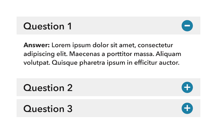
Let's look at this wireframe example for an FAQ section on a page.

After reviewing this image, how would you decide on what the intended interaction would be for someone to consume this content? Which HTML elements should be used to convey the meaning and purpose? What will the elements sound like when focused, and how will someone interact with it by using just the keyboard?
From what we know so far, there is a list of text items along with "plus" and "minus" icons, giving an indication that this is an accordion style widget. When one of the list item controls is activated, the FAQ content will be revealed.
How should we write the HTML for each list item control in order to convey the meaning and purpose of the widget?
Which element should we use?
It's fairly easy to make something work when using a mouse or touch input device. You could attach a JavaScript click event listener to a parent <div> or perhaps an <h2> heading to reveal the related content and it would work just fine. The problem with adding click handlers to just any HTML element is that it won't convey the correct meaning (semantics) for people who rely on assistive technology. When read aloud by the screen reader, the feedback needs to include information about the element, not only the name of the element but also its role (what it is) and its current state. This information gives insight on how to interact with the element.
People who only use a keyboard for input will also have a disadvantage, as <div> s and heading elements are natively unable to receive keyboard focus. So what should we use instead?
Correct semantics
The element we decide to use needs the correct semantic meaning in order to accurately convey the purpose of the widget, and by association, how to interact with it.
The element required for this interaction would need:
- The ability to receive keyboard focus
- A role which indicates that the element we're focused on will shift focus upon activation (to the content container)
- The browser focus to change, on activation, to the content container
Some developers may take this information and assume that they had to create a custom control with all these requirements. However, there's already such an element readily available just for this task, the <a> with a valid href attribute. Link elements are, by default, focusable. Their role of "link" indicates that you can press the Enter key to submit its function, and that it will either open a new page or shift focus to somewhere else on the current page.

With this setup, our accordion widget list item control has almost everything we need to convey its meaning and purpose.
The state of things
One other piece of information we need to include for this accordion example is the current state of the list item control. An accordion control can either be "expanded" or "collapsed". The state also helps to give extra meaning and context for what the element does and its intended purpose.
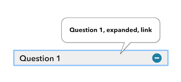
Since the accordion is a custom widget, we can accomplish adding a state in a couple of ways. We could either include some visually hidden text alongside the link text, or by applying an aria-expanded attribute, whose value would toggle to true or false on the click event.
Visually hidden text code example:
<a href="#answer-1">
  Question 1
  <span class="visuallyhidden">, expanded</span>
</a>
The same code example, using ARIA:
<a href="#answer-1" aria-expanded="true">
  Question 1
</a>
Whichever path you decide, be sure to test with a screen reader and make sure the state is announced as expected, and to update the state value on the click event in order for this content to be heard when the element receives focus. (Details on how to test follow in part 3 of this series).

Managing focus
Oftentimes widgets or complex interactions require some extra attention with managing keyboard focus. This is the act of moving the browser cursor from one element to another in order to provide a seamless and understandable user experience for people who can't see the screen and for those individuals who use the keyboard exclusively.
You know if a widget requires management of the browser cursor when an interaction takes place and you are required to move your eyes to begin reading the newly revealed content. In the same manner, the browser cursor should also be moved to the same location.
In the example of the accordion widget, on activation, focus will be moved away from the list item control and onto the container of the revealed content. From here, people will be able to continue reading the content from the next logical place. For screen reader users, the action of moving the browser cursor also helps to indicate that the click event successfully completed.
Now it's your turn
The next time you're presented with the challenge of writing a new piece of markup or fixing an existing bug, remember to use native, semantic HTML elements as a base. Consider how something might work when interacting with a screen reader or a keyboard. This helps people using your site understand the page layout, and it helps them to know where they are on the screen as they navigate around in order to interact with your content.
In the third and final instalment of this article series, we will go deeper into what screen readers are, how they are used, and the basics of testing your code to see how it might sound with screen readers.
