Testing Color Design for Accessibility

Contrast is the difference in luminance or colour that makes an object (or its representation in an image or display) distinguishable. In visual perception of the real world, contrast is determined by the difference in the color and brightness of the object and other objects within the same field of view.
In other words, how readable is text against its background? If the contrast is low, people will have greater difficulty with reading the text. On the other hand, a higher contrast will allow for easy reading.
In regards to web accessibility, color contrast is the #1 offender on the web when it comes to accessibility issues. Unfortunately, it seems as though modern design overlooks this issue and often includes text which is only readable by those who have strong enough vision to do so. Colors like grey on black, light grey on white, etc. These color combinations, as well as a host of others, can be very difficult for some people to perceive.
In order to be more inclusive with our color choices, let's look at how we can test our colors to make sure they're readable by as wide an audience as possible.
Contrast threshold
When it comes to choosing which colors to use for your design, there is a specific number, or contrast ratio, to reach for. This threshold has been determined by the W3C as a way to ensure people with low vision are able to read text content.
The threshold breakdown is as follows:
| Object | Ratio |
|---|---|
| Text and images of text | 4.5:1 |
Large text (greater than 18pt) |
3.0:1 |
| Non-text (borders, icons) | 3.0:1 |
As displayed here, the threshold is more forgiving for larger text and non-text content, such as input borders and icons. However, we still need to ensure these elements are also highly visible.
Now that we know what to watch for and which ratios should be used to test which type of content, how do we actually test the contrast ratio of our colors to ensure readability?
Contrast tools
We have available to us quite a number of color contrast testing tools. Some are more automated than others; which one you use might depend on your current need.
Here are a few contrast ratio tools to consider:
- Snook's Color Contrast Checker is a great tool for testing the contrast ratio, includes lots of other details
- Lea Verou's Contrast Ratio calculator has a nice and simple user interface to test color contrast
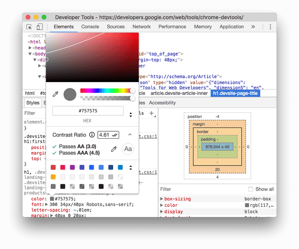
- Chrome Dev Tools has color contrast tests built-in to its developer tools
- Lighthouse is another set of tools built into Chrome which includes automated accessibility testing, including color contrast tests
- Color Contrast Analyser for Sketch is a Sketch plugin that calculates the color contrast of two layers and evaluates the output against WCAG requirements
WCAG success criteria
This comes back to 1.4.3 Contrast (Minimum) and 1.4.11 Non-text Contrast which state:
"The visual presentation of text and images of text has a contrast ratio of at least 4.5:1."
"The visual presentation of User Interface Components and Graphical Objects have a contrast ratio of at least 3:1 against adjacent color(s)."
Don't rely on color alone
When it comes to relaying messages to the user, especially something important such as an error or success state of a form, how much time is left to complete an exercise, or sections of a pie chart, it's best to not rely on color alone to convey this information. People with low vision or color blindness may have a difficult time understanding the content.
There are different types of color blindness and low-vision impairments which makes perceiving specific colors difficult or impossible. With this in mind, to help convey this important information, it's ideal to include other visual indicators such as:
- An icon alongside error text
- An underline for links embedded within the body copy
- Textures or patterns to differentiate sections of a graph or chart
With these extra visual affordances, people with color blindness, low-vision, or perhaps even a cognitive disability will have greater success in using and completing various tasks on your site or app.
WCAG success criteria
This comes back to 1.4.1 Use of Color which states:
"Color is not used as the only visual means of conveying information, indicating an action, prompting a response, or distinguishing a visual element."