7 Tips to Increase the Accessibility of Your Debut Theme Shopify Store

Table of contents
Accessibility is about being mindful when creating content, designing experiences, and writing code. The purpose of which is to be inclusive of people who rely on assistive technology. Making a site or app accessible has the added bonus of increasing usability for everyone. It also places your business at an advantage over the competition.
When it comes to ecommerce, providing an accessible storefront has the potential to increase revenue and buyer retention. The estimated disposable income for working-age Americans with disabilities is approximately $490 billion. Yes, billion. Read on as I share tips on how to unlock this revenue potential!
A Focus on Debut
You've got a great head-start on providing a more inclusive buying experience when using Debut Theme. Since Debut is the default theme every merchant starts with, Shopify's Accessibility Team worked with the Themes Team to test and fix issues. Why? To enable a positive and successful buying experience for people with disabilities.
Examples of where Debut increases accessibility includes but is not limited to:
- Keyboard accessibility; visible focus states and focus management
- Links, buttons, and form controls with clear labels
- Accurate form error messaging and guidance
- High color contrast for default styles
- Valid HTML, proper heading levels, and landmarks to aid in navigation
- ARIA attributes to convey dynamic component context and state
What all this means is Debut does a lot of "heavy lifting" in the background. In doing so, you as a Merchant are free to do what you do best; create engaging content and sell your product.
Create accessible and inclusive content
I've been a Shopify merchant only a short while, but it's been a lot of fun. When writing content and adding products to my own store, I noticed there were a few key points I needed to be mindful of.
- When adjusting theme colors, I needed to test color contrast for legibility.
- When adding product images, I needed to write descriptive alt text for each variant.
- When writing content on my blog posts and content pages, I needed to provide clear sectioning via heading structure.
Let's review each of these in more detail and a few other key points in creating an inclusive and accessible shopping experience.
1. Write inclusive content
Why do people visit a website? What keeps them coming back for more? Most likely its high-quality content. Content makes up the essence of the web and why people spend so much of their day there. As a result, the content we create needs to be well designed to provide a welcoming user experience.
Not all users of the web have received the same amount of education in their lifetime. Some of us read at different levels and at different speeds. Content which is full of jargon, acronyms, and other complexities may be difficult to understand.
How then do we write quality content that is informative and inclusive to meet the needs of our readers?
Adjust content reading level
To ensure content is clear for as many people as possible, test your content with the Hemingway app. This utility will analyze your content and make recommendations based on readability.
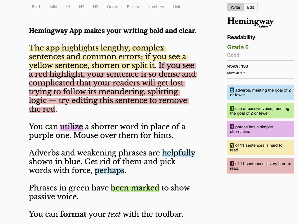
Some of the recommendations include:
- Considerations when using adverbs
- Use of passive voice
- Complexity of phrases
- Difficulties in sentence comprehension
By following the recommended changes, you will end up restructuring your content to better suit a more general audience. The recommended reading level for inclusive content is usually 7th or 8th grade reading level. The Hemingway app will let you know how your content holds up in this regard.
Open to a wider audience
When writing content for the web, it's important to explain certain details of our content. The purpose of which is to not leave anyone out of the conversation. For example, a reader whose primary language is not of the source material.
Take care when using an acronym, abbreviation, numeronym, or complex terminology. Include the full name, a brief explainer text in parenthesis, or a link to more information. This will help to keep the reader "in the know."
Here are two examples:
"The United Nations (UN) is an intergovernmental organization that was tasked to maintain…"
"HTML (HyperText Markup Language) is the most basic building block of the Web…"
Remember, the idea is not to "dumb down" your content but rather open it up to a wider audience.
Designing for Dyslexia
Someone with Dyslexia, which is a disability that impairs a person's fluency or accuracy in being able to read, write, and spell, may have difficulty reading content on the screen.
There are a few design considerations for making text itself readable for people with Dyslexia. The following are things to avoid when designing content:
- Justified text – Justified text can cause dyslexic readers to lose their place when reading. To avoid this frustration always left align text (or right align, depending on your region.)
- Very high contrast – Text which is pure black against pure white can generate a very high contrast reading environment. As a result, some dyslexic users may experience words to swirl or blur together. (We'll discuss contrast more in the next section.)
- Italicized content – Use of italicized text can result in a poor reading experience for people with Dyslexia. This is due to the slanted nature and extra pixelation of letter shapes.
Key takeaways
- Produce content to be 7 - 8 grade reading level.
- Test readability of content with Hemingway App.
- Explain acronyms, abbreviations, numeronyms, or complex terminology using plain text.
- Avoid justified text. Use italicized text sparingly.
- Review "Content Accessibility 101" for more information.
2. Provide enough contrast
Have you ever been outside trying to read on your phone only to have the glare of the sun prevent this from happening? Me too. The issue here is contrast.
Contrast is the difference in brightness that makes text distinguishable against the background. If the contrast is low, people will have greater difficulty with reading your content. But, a higher contrast will allow for a better reading experience.
Test for color contrast
Let's review how to test your store's text color with the main background color. We'll first need to get the current color values from the Theme settings, then use a tool to test the color contrast.
- From the Shopify Admin homepage, go to Online store > Themes > Customize > Theme settings > Colors.
- Click the Text > Body Text color swatch.
- Copy the Hex color value – this is the six characters starting with the hash (
#) symbol. For example, the default text value for Debut is#333232(very dark gray.)
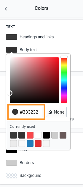
Repeat steps 2 and 3 to get the color for the Page > Background. This default value is #FFFFFF (white.)
Now that we have the two color values let's test the color contrast. There are many tools available which test color contrast. For our needs, let's open a new tab in our web browser and go to Contrast-Ratio.com.
Paste the background color (#FFFFFF) into the "Background" text box. Then the text color (#333232) into the "Text color" text box. The test should pass with a green dot in the middle of the screen with a ratio of 12.78.
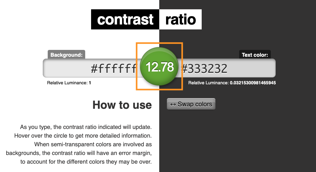
Which colors pass and which fail?
The number in the middle of the screen represents the color contrast ratio. To keep a passing ratio (colors which provide high contrast) we must ensure the colors we choose result with a number greater than 4.5. This is a passing grade for "regular size" text (below 18pt). The result must be greater than 3.0 for "large text" (above 18pt), form input borders, and icons.
For example, changing the text color to #CCCCCC (very light gray) results in a test failure. The dot in the screen turns red and the contrast ratio is 1.6. This is lower than the required 4.5 contrast ratio and would be very difficult for most people to read.
Here's a handy table to help with all these details:
| Object | Ratio |
|---|---|
| Text and images of text | 4.5:1 |
Large text (greater than 18pt) |
3.0:1 |
| Non-text (borders, icons) | 3.0:1 |
Enough contrast is key
When adjusting the default colors of your theme, make sure to test the color contrast. Low contrast (below the 4.5 ratio) means people with low vision may be unable to read your content. It's also possible to provide too high contrast. For example, using pure black on a pure white background can create a blurred effect for people with Dyslexia.
Provide enough color contrast to ensure a comfortable reading experience for all readers of your content.
Key takeaways
- Higher color contrast ensures people with low vision can read your content.
- Test color contrast of all text, links, form controls (use Contrast-Ratio.com or similar contrast tools.)
- Test results should be above 4.5 for regular size text and above 3.0 for large size text, form input borders, and icons.
- Review "Testing Color Design for Accessibility" for more information.
3. Describe product images
Imagine going to an online store with no product images, or any imagery at all. Would the text-only product description be enough to help you understand the product's physical characteristics? Without imagery, making the choice to commit to buy a product may be difficult.
Unfortunately, this is a common occurrence for people who have low-vision or are blind who rely on screen reader technology. Without accurate and informative image descriptions, you may be missing out on potential sales. This is why it's so important to provide alt (alternative) text for all product and product variant imagery.
How to write alt text
When you need to write alt text to describe an image, try this exercise:
- Sit across from or video chat with a colleague, friend, or family member.
- Without showing the photo, describe out loud the image details.
- If it's a group of people, describe where they are or what they're doing.
- If it's a scenic sunset, describe how the sun is beaming off the surrounding trees or buildings.
- If it's a product, describe its physical features in detail.
- After you've described the image, reveal the photo. Ask your counterpart to compare what they pictured in their mind against the real thing.
This exercise jump-starts the process of writing a description for the image. You may need to pair down the text to make it more precise, but you're well on your way to adding helpful alt text for your image.
Example text
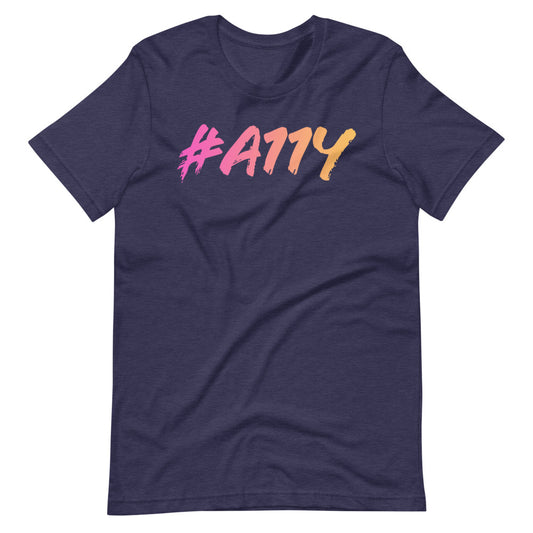
Here's an example for a product description. For my "Hyper #A11Y T-Shirt" shirt displayed below, I wrote the following alt text:
Left to right, dark pastel pink to pastel yellow gradient, large #A11Y letters on front of heather navy blue t-shirt.
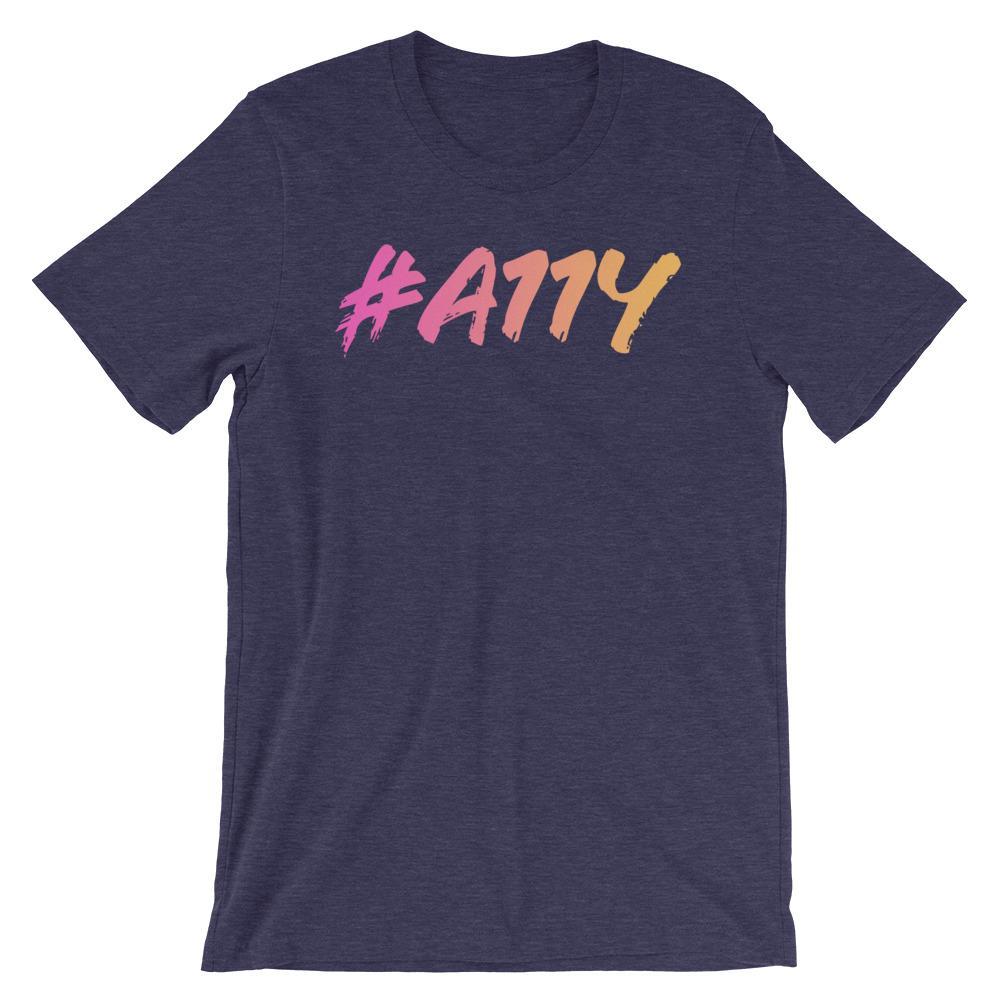
Does this description do the trick of describing the image? I believe it does, though there could be more or less descriptors. Use your best judgement and focus on the core product aspects.
How to add alt text to an image
Let's add this alt text to the product image. From the Shopify Admin homepage:
- Go to Products and choose a product.
- Under the Media section, click one of the product images revealing the image editor.
- On the right side of the screen, click "Add alt text". Fill in the text box with the image description and click "Save alt text."
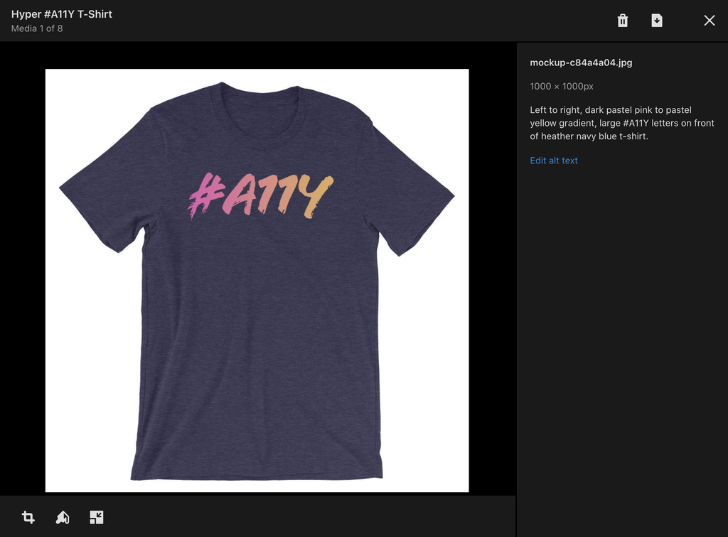
With the alt text set, a screen reader user will hear the image description when navigating through the page content. By describing a product's physical features, the user will have a better understanding of the product which may lead to a sale!
Key takeaways
- Alt text helps to share product details with screen reader users.
- Describe what's displayed in the image, not what the image is about.
- Apply alt text to your product and product variant imagery.
- Be precise – don't overwhelm someone with too much information.
- Review "How To Write Alt Text and Why It Matters" for more information.
4. Embrace the keyboard focus ring
Imagine loading a web site without your mouse cursor helping to guide your way through (yes, this is possible!) Without the mouse cursor, how would you navigate? You wouldn't know if you were hovering over a link or button, an image or plain text – what a frustrating experience!
Unfortunately, this similar experience is often true for anyone who's unable to use a mouse. This might include people with a motor impairment, cognitive impairment, chronic pain, or more. This also includes temporary or situational impairments such as someone holding a baby. Don't fret, people can still navigate through a page with the next best thing; their keyboard.
Navigating with a keyboard
When using the keyboard to navigate, browsers indicate the current location with the keyboard focus ring. This ring acts as the "mouse pointer" in this case, showing exactly where the user is while navigating page content. It's often a blue or dotted black outline which appears when a link, button, or form input is in focus.
It may be tempting to have this ring removed for visual design reasons, but this results in an accessibility barrier. So, it's very important to embrace the focus ring.
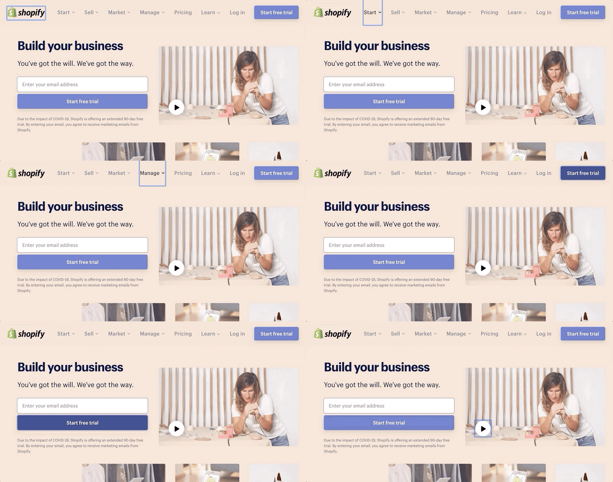
Debut features a visible focus ring by default, so you don't need to do anything in this case.
Try it yourself! If you're on a desktop or laptop computer, start using the Tab key to move the keyboard cursor forward. Use Shift + Tab to move backward. Can you see which item on your page has focus? Can you move from your homepage to product page to checkout with your keyboard?
Key takeaways
- The focus ring is the mouse cursor for non mouse users – embrace it!
- Make sure the focus ring is visible in your theme.
- Try using the keyboard alone to move from your homepage, to a product page, then to checkout.
- Review "Keyboard Accessibility Best Practices" for more information.
5. Headings are navigation, too
Headings serve the purpose of introducing a new section of content. They are visually represented by large, bold text on screen and range from Heading level 1-6. But, they also serve as a way to navigate page content, too. How? Let me demonstrate.
Imagine you're at a new restaurant. When reviewing the menu, how might you narrow down your choices?
-
First, the cover of the menu might have the name of the restaurant. This is confirmation you're at the right place. The restaurant name could be considered the primary Heading level 1.
-
Next, you review the categories of food available. Appetizers, salads, burgers, pizza, seafood, etc. Since these each represent a section of the menu, these could be a Heading level 2.
-
Feeling hungry, you dive into the pizza category. Plain cheese, pepperoni, veggie, meat lovers, Hawaiian (yes please). These represent items available under the "pizza" category. Thus, each item could be considered a Heading level 3, under the "pizza" Heading 2.
In the same manner as pursuing a menu, a first-time visitor who relies on assistive technology might navigate via headings. Heading navigation is one method available for a screen reader user to gain an understanding of the content available on a page.
Adding headings to your content
It might be tempting to add headings by increasing the text size and formatting with bold text. But, proper heading structure includes usage of HTML h1 through h6 elements.
For example, in the previous menu analogy, the restaurant name would be the primary Heading 1 (HTML h1 element.) Each category (salads, pizza, etc) would be a Heading 2 (h2). Each pizza flavor (pepperoni, veggie, etc) would be a Heading 3 (h3).
To add a heading to your page or product description in the Shopify content editor:
- Go to a content or product page
- In the text editor, highlight the text you wish to make a heading
- Activate the Formatting button in the toolbar to reveal the heading options
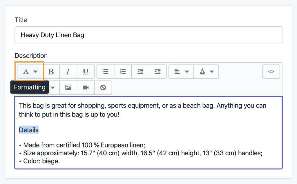
Note: Most themes insert a primary Heading 1 (h1) for page and product titles. So it's a safe bet to start a new section with a Heading 2 (h2), a subsection with a Heading 3 (h3) and so on.
With logically ordered heading structure, screen reader users will have a much easier time finding their way around and discovering your content.
Key takeaways
- Headings can be used as navigation for screen reader users.
- Provide logical heading order – start with Heading 1, use Heading 2 for sections, Heading 3 for subheadings, etc.
- Insert headings using the ‘Formatting' text tool.
- Review "How Headings and Landmarks Help Accessibility" for more information.
6. Use lists for list content
I use dropshipping for my Shopify store. When I create a new item my dropshipping service provides a brief description of the product. This makes adding content to my product pages quick and painless. But, one problem I noticed is the provided text does not include structure (semantic HTML) when copied and pasted into the Product text editor.
There are usually two things I end up doing when adjusting this content to be more accessible:
- Add a heading structure, which we discussed in the previous section, and
- Add a list structure for list content.
The supplied product descriptions often come with a visual bullet character to indicate a list item. The issue here is when a screen reader encounters this content, it would announce, "bullet". No other details are provided to convey an actual list of items.
Using an HTML list element (ul or ol) helps screen reader users by announcing the presence of the list and the total number of items. With this, the user can choose to continue exploring the list or skip past the list.
Adding a list to your content
Let's add structure to some list content. In the Shopify Admin:
- Go to a content or product page
- In the text editor, place the cursor on the text you wish to make a list
- Activate the list button in the toolbar – either the bullet or numbered list, depending on your needs
- At the end of each list item, press Enter to create a new item
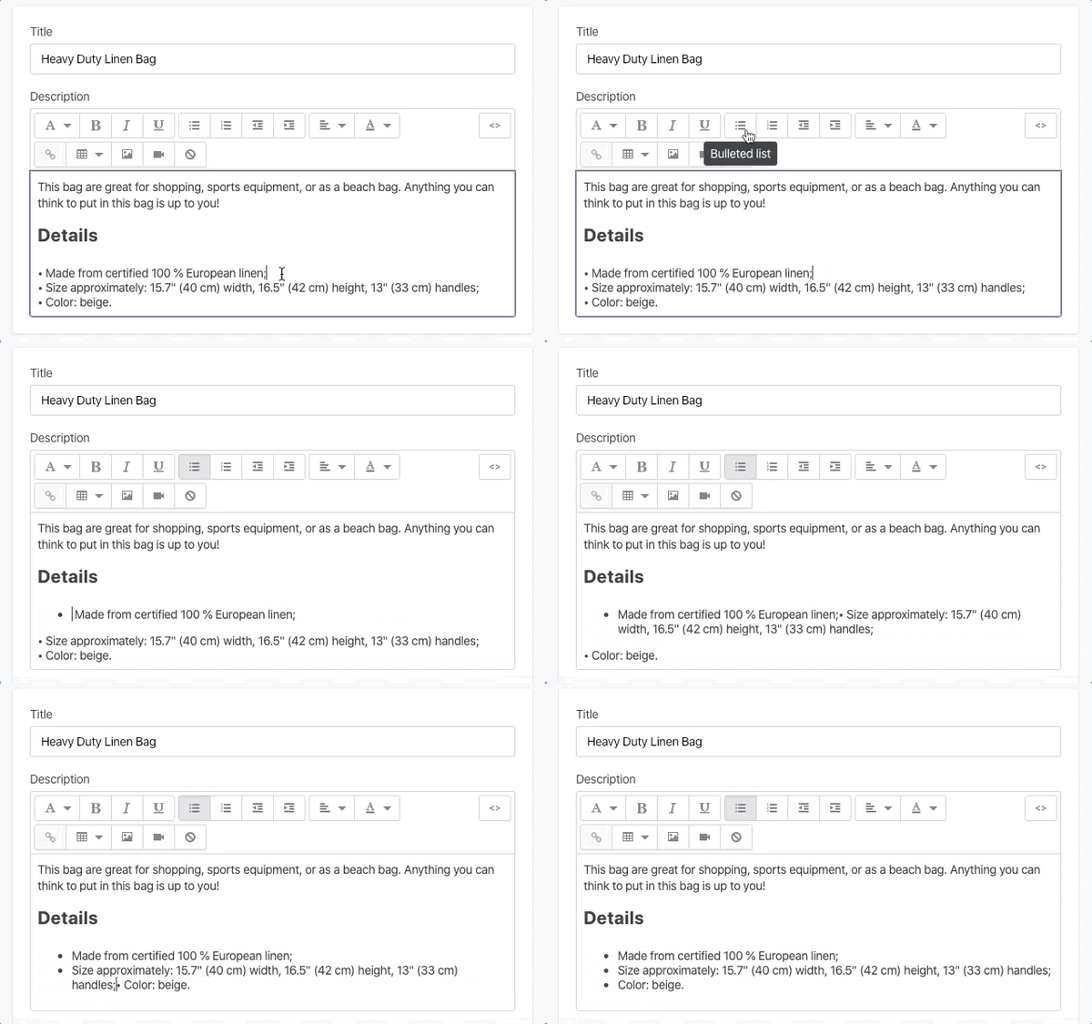
We've now provided meaning to our content through the use of semantic HTML elements. In this case, the unordered list (ul) element which conveys the presence of a list and how many items are in the list.
Key takeaways
- Lists inform screen reader users the total number of list items and the option to skip over the list entirely.
- Format list style content using the ‘Bulleted list' or ‘Numbered list' tool, not with bullet/dot characters.
- Review "When to Use Lists and Why They Matter" for more information.
7. Next level inclusivity with captions and transcripts
Imagine you're in a busy mall with shoppers milling about and chatting all around you (well, perhaps not so much in 2020). You bring out your phone to watch the trailer for a movie you're considering seeing. As a result of the mall patrons, you have a tough time hearing the sound. Next you realize, "Wait, I can enable captions!" A few taps later reveals… no captions have been added to the video! Now how are you supposed to hear the trailer?
As frustrating as this would be, this scenario happens often for people who are Deaf or hard of hearing.
Providing video content without closed captions creates an accessibility barrier. Likewise, serving audio without a plain-text transcript is another barrier. To avoid these issues, make sure closed captions and audio transcripts are provided.
Including closed captions
Including closed captions is a must for video content with a spoken word. How you accomplish this task is dependent on your video player or video hosting service of choice.
Popular video services, such as YouTube and Vimeo, include the option to add closed captions to any video. Some even feature auto-generated captioning. While auto captions can be convenient and save time, these tend to come with some inaccuracies. To provide the best experience it's recommended to add your own captions.
Here's how to include closed captions for these video services:
- YouTube includes details in its help document titled, "Add your own subtitles & closed captions"
- Vimeo outlines its process in the help document, "Captions and subtitles"
Debut's homepage video sections and product media features YouTube video support. When hosting on this platform, ensure closed captions are available for all video content.
Audio descriptions
Audio descriptions in video are important to share what's happening in-between spoken dialog. People with low-vision or who are blind will benefit from hearing the details shared in the audio description.
Information shared in the description might include:
- A change in scenery
- A character performing an action
- Brief descriptions of silent emotion
When creating video for the web, provide an audio description (when appropriate.) When including audio descriptions, consider providing a second audio track. Not everyone would want or appreciate hearing audio descriptions all of the time. If your video player doesn't support multiple audio tracks, you may need to provide a separate video altogether.
For example, compare the audio of the Apple – Accessibility – Sady video with Apple – Accessibility – Sady (with Audio Descriptions). Notice the extra bits of information described in-between people speaking. It may be helpful to think of audio descriptions as image alt text for specific scenes of a video. Use enough words to paint the mental image in the viewers mind yet not be overbearing with too much data.
Provide audio-only text alternative
If you're serving audio-only content, such as a podcast, provide a text transcript alternative. Transcripts are a plain-text version of your audio-only content. Transcripts have the benefit of, such as:
- Allowing people who are Deaf or hard of hearing to consume your content
- Search engines will be able to crawl through and include the transcript text in their indexes, making your content searchable
- People in noisy environments will be able to read the content rather than straining to hear it
- Notable pieces of content can be easily shared across social media, narrowing the gap on readers finding and consuming your content
For example, The Unofficial Shopify Podcast features transcripts for each episode. Its transcripts are hidden by default but the link to display the content is placed alongside the Episode Details link.
You can create captions and transcripts yourself or consider hiring a service to generate them for you, such as Rev.com.
Key takeaways
- Provide closed captions for video content
- Produce video which features audio descriptions
- Include a text transcript for audio-only content
- Review "3 Tips for Audio and Video Accessibility" and "Accessible by Default: Peppa Pig" for more information.
Further learning
Take your accessibility knowledge even further by checking out the following recommended links!
- W3C – Accessibility Fundamentals
- Google Web Fundamentals – Accessibility
- Google Chrome Developers – A11ycasts
- TEDx: When we design for disability, we all benefit
- How to Create Interfaces that Benefit All: Accessibility Testing and Inclusive Design Principles
- Making the Case for Accessibility
- Accessibility for Everyone

