Thus, I've decided to open up my Accessibility Office Hours to product teams and organizations outside of Shopify.
If you're looking for digital accessibility tips or curious about the accessibility of a design or component that you're working on, let's review it together. If you're a designer at a small firm, an engineer at a large org, or a project manager leading a team, these sessions are for you.
These are 30-min sessions to ask questions about digital accessibility in real-time. You'll receive insight into:
I've had great success working this way within Shopify. Notably, our Free Themes and Checkout product teams have been my primary focus for the last 6 years. These two product spaces are dynamic, high impact, and highly accessible by default.
Prevent accessibility issues from shipping to production. Save your business time and money. Increase your public perception and product market reach from day-one. Accessibility is good for business.
Book your session:
Book Component Review SessionScott Vinkle is a web accessibility specialist from Toronto, Canada. Scott leads accessibility at Shopify, the all-in-one commerce platform to start, run, and grow a business. Scott also writes, speaks, leads workshops, and shares tips about accessibility around the web.
Scott's goal is to assist organizations with all things digital accessibility. He believes accessibility to be a key factor in the long-term success of any business. Scott brings 12+ years of accessibility experience to help product teams deliver highly accessible user experiences from day-one.
]]>I was once on a podcast for new entrepreneurs. The host of the show asked me for advice on incorporating digital accessibility best practices for an online business from the start.
Questions such as; what is digital accessibility, why is it important to your business, and how to incorporate best practices?
In this post I share my show notes with my answers to the questions asked. My hope is that they help you in your journey into entrepreneurship.
My typical definition that I like to share is, “Digital accessibility is about making products, websites, and apps usable for people with disabilities who use assistive technology.” While this definition is sound, I also want to share a definition of accessibility from the consultancy firm, Tilting the Lens. They're notable for their recent work with British Vogue and bringing disabled models to the forefront of the fashion industry.
Their definition reads:
“Accessibility is a continuous and evolving practice.
It is achieved through intentional, meaningful and intersectional participation of people with lived experience of exclusion.
Accessibility must be key to each stage of a product, place or policy development, from ideation through to delivery.
Solutions must be designed with Disabled people to prioritize form and function.
Meaningful and deliberate accessibility builds inclusion, equity, agency, creativity, innovation and pride.”
I love this definition as it clearly outlines what's needed to build inclusive environments. It also beautifully captures so much of what accessibility practitioners and leaders try to share every day.
There are so many everyday products that were designed by and for disabled people that able bodied people use often. For example, the accessibility settings on your phone; dark mode, large text, live captions if you're in a noisy environment, motion settings in case you feel motion sickness, and more. These are all accommodations anyone can use; accessibility makes for better products for all users.
When it comes to the business side of things, accessibility helps to enable greater success in entrepreneurship. It does so by making your product open and available to more people. More people means more growth opportunities, increased revenue, positive public perception, and so on.
There was a study done which showed how consumers identify with and remain loyal to brands which reflect their own values. A key takeaway was, “82% of shoppers want a consumer brand's values to align with their own.” Some of the values mentioned in this study reflect the idea of inclusivity which is at the heart of accessibility.
If you want to have a competitive advantage, adopt an inclusive mindset. Implementing accessibility in your core workflows will help make this a reality.
There's an annual study called The WebAIM Million. This study reviews the accessibility of the top 1 million homepages. The study shares, “Across the one million home pages, [almost 50 million] 49,991,225 distinct accessibility errors were detected — an average of 50.0 errors per page.” This goes to show that accessibility is, unfortunately, not the norm. If your business provides an accessible user experience by default, this will set you apart from your competitors. People will take notice and recognize this is a part of your business values. And as a result, your product will be available to more people.
Here's a few quick stats on disability:
These stats represent the potential in increased customers and additional revenue for your business when you invest in accessibility. Let those numbers sink in.
The AODA (Accessibility for Ontarians with Disabilities Act) first became a law in 2005. It aims to identify, remove, and prevent barriers for people with disabilities.
The AODA is quite clear on the law's expectations on what needs to be made accessible and how to go about doing that. One of the key points of the AODA states:
“As of January 1, 2021, the AODA requires you to make all public websites accessible if you are either:
- a designated public sector organization or
- a business or non-profit organization with 50 or more employees
These requirements only apply to websites and web content published on a website after January 1, 2012.”
The key date here being January 1st, 2021. The expectation was for digital properties for businesses in Ontario to be accessible.
How the AODA is measuring accessibility is the W3C's Web Content Accessibility Guidelines, or “wuh-cag” for short. WCAG is generally recognized as the industry standard for testing for accessibility success criteria.
For example, a few specific things to watch for include:
If you're a business owner and you're discovering this message for the first time, it might be in your best interest to speak with your engineering or design teams. Put a plan in place to discover and remediate accessibility defects in your product. Avoid shipping them in the first place.
You could also consider working with an accessibility consultancy agency. These agencies specialize in digital accessibility and will thoroughly review your online properties (websites, web apps, native apps, etc) for digital accessibility best practices. This practice typically helps to get your product up to speed relatively quickly.
If you're in a position to do so, here's a few recommendations to help you get started down this path:
The Ontario.ca government website has a page called, “ How to make websites accessible” which explains everything in more detail.
In addition to meeting the AODA, businesses in Ontario must file a report with the Ontario government with details on accessibility compliance. The purpose of which is to confirm that you have met the current accessibility requirements under the AODA.
The key date here is December 31, 2023 which is the next opportunity to submit a report.
The Ontario government website has more details on this as well on a page called, “ Completing your accessibility compliance report.”
It's worth mentioning that the AODA is one provincial law in Canada. There are other accessibility laws to consider as well:
These laws use the same Web Content Accessibility Guidelines as a means to measure and report if a digital product meets conformance. The EAA includes some additional requirements but WCAG 2.1 Level AA is a great starting point. This standard is considered the minimum for any digital product.
I'm going to share some quick advice on what to do, followed by what not to do. What not to do is just as important as the positive changes you can make for your business.
During the procurement process of adopting a new platform (or third-party components such as a customer-facing theme or app,) ask to review an Accessibility Conformance Report. This could also be called a VPAT document (Voluntary Public Accessibility Template.) This is a public document showcasing which standard the vendor used to evaluate the accessibility of their product, and exactly where it excels and where it falls short in terms of conformance.
You can find examples of these around the web. For example, search for, “Google VPAT,” “Apple VPAT,” “Adobe VPAT,” etc. Most companies should have these publicly available. Shopify's VPAT documents are located at shopify.com/accessibility.
Why is this important? As a business owner you need to understand exactly what you're buying. Making the decision to purchase and build a business on a platform comes easier when you're aware of its accessibility capabilities.
In the case where you ask for this report and the vendor comes back with nothing to show, you may be adopting a product which is inaccessible. Accessibility may not be part of their core principles; it might be best to move on.
Making the decision to purchase and build a business on a platform comes easier when you're aware of its accessibility capabilities.
If they do have a conformance report available, review it thoroughly. Look for any line items which state, “Partially Supports,” or “Does Not Support.” These items will contain details about existing defects. And that's okay. It means they're aware of the problem and they're working on it. Feel free to inquire about the status of those items and if there's a plan in place to have the know defects addressed.
Now, if you're in the situation where you've already adopted a platform and your business is well underway, it's still worthwhile reaching out to ask about these reports. Check in with customer service and ask to review a VPAT. If one doesn't exist, push for one to be created and for the platform to take ownership in this space. Business values need to align with all parties.
Next, content to add to your own website; an accessibility statement.
An accessibility statement, which is typically linked from the footer section alongside terms of service or privacy policies, is a page which clearly defines a number of pieces of information:
Last point is to test. And test often . Test your storefront for common accessibility defects using a number of tools. There are many tools out there, both free and paid, which can help guide your testing and remediation efforts.
And use more than one tool. I personally use a variety of tools as not all report the same information on found defects.
Specific tools that I use:
It's worth mentioning that automated tooling is a great way to get started and catch those “quick-wins”, but just because a tool may report back with zero issues doesn't mean your site is completely accessible, or even usable.
I'd also strongly recommend having your site tested with actual people who use and rely on assistive technology; the true experts. Usability testing is where you'll catch the majority of high impact issues. Testers will get back to you with detailed information on major blockers and also provide ideas to help make your product even more inclusive (which makes the user experience better for everyone.) You'll learn a lot along the way.
Just because a tool may report back with zero issues doesn't mean your site is completely accessible, or even usable.
My go-to platform of choice for usability testing is Fable. Fable is an integral part of my own workflow at Shopify. I rely on their vast team of testers to help provide feedback on a component or entire user journey a Shopify team may be working on. The idea being, when I go to Fable I know the accessibility is pretty good, but how do we make it great? I want to make sure people will enjoy the experience and want to come back for more.
It's important to think about accessibility as an investment, an ongoing process for the long term, not as a one-off feature.
That's what to do at a high level. Here's what not to do.
Don't ignore accessibility and think that it'll go away on its own. Don't say to yourself, “We don't have disabled customers who want to buy our products or use our services.”
Are you sure?
By doing nothing, you're losing business. By doing nothing, potential customers are going to your competitors who have accessibility baked-in to their products. By doing nothing, you open yourself to digital accessibility lawsuits.
A recent study showed that 71% of assistive technology users will abandon a digital experience that is difficult to use. This is a significant market share.
It is absolutely in your best interest for yourself and your business to act.
Be proactive. Educate yourself. You've got everything to gain.
An accessibility overlay is a third party product installed on a web site. This typically results in a little button with a wheelchair or universal design logo appearing in a bottom corner.
Companies behind these products often claim that this will fix all your accessibility problems, that you won't have to worry about it “ever again.” But, these products are actually problematic for a number of reasons. A few of which include:
My recommendation is to stay away. They're not the solution you're looking for. Review OverlayFactSheet.com for more details.
The expectation is for the website or app to just work with assistive technology.
When you do nothing or add an overlay to your site, you're steering the ship in the wrong direction. You need to course correct and educate yourself. Instead:
If all goes well you should be in great shape to provide an inclusive and accommodating user experience for more people in order to 1) grow your business and 2) beat your competitors.
By investing in accessibility you have everything to gain. Start today.
]]>Fast forward a few months later, when a handful of talented volunteers from Shopify would start working on a new React Native app called COVID Shield: a COVID-19 exposure notification solution. While the team was working on COVID Shield, I was brought on to conduct accessibility testing as development was taking place.
This post includes details on how I tested COVID Shield for accessibility, closely reviewing a few key issues, and the related solutions to those issues. Hopefully, this advice will help you test your own apps to ensure you're creating an accessible experience for all your users.
Before we dive into those details, it's worth noting COVID Shield was adopted by the Canadian federal government to provide Canadian citizens a notification method for potential exposure to COVID-19. The app was rebranded as COVID Alert. Future development was taken over by the Canadian Digital Services team. Now, let's jump in.
Since the COVID Shield app was in active development, my testing environment included a few tools other than real-world, physical devices:
apk
installedFor a full understanding of how to use these tools to test app accessibility, you can read my post Mobile Screen Reader Testing.
Facebook has made sure app developers are able to create accessible and inclusive user experiences by means of the React Native Accessibility API. This was my go-to resource when it came to making any recommendations to the team.
This API includes a series of React methods and props to provide information like roles, names, and state to interactive elements. It also includes other items to increase general accessibility of an app while using assistive technology.
If you're at all familiar with HTML, the DOM, or the ARIA spec, then you've got a good start on using the Accessibility API. Concepts such as adding a role
to an element to provide semantic meaning, setting a label on a control via aria-label
, or hiding something completely with aria-hidden
are all possible.
Let's start with the concept of adding semantic meaning to an element: role, name, and state.
When developing for the web, authors have native "clickable" elements with which to work; button and link elements. A button
is typically used to submit a form or perform an on-screen action, such as launching a modal window. Links are used for requesting new data or shifting focus from one point of the screen to another. These elements come with their respective semantics, shared via their role, name, and state (if applicable.)
In my experience with the COVID Shield app, the team decided to make the app appear more native for each platform by way of a custom Button
component. This component included some logic to generate platform-specific touch controls. For example:
TouchableOpacity
componentreact-native-material-ripple
packageif (Platform.OS === 'android') {
return (
<Ripple onPress={onPressHandler} …>
{content}
</Ripple>
);
}
return (
<TouchableOpacity onPress={onPressHandler} …>
{content}
</TouchableOpacity>
);
The issue I found with these components was they did not include a role to help convey the purpose of the clickable element. Without the information of what this element is, the user may not understand what may happen when the element is interacted with. We want to help our users not only be successful when using our apps, but also to be confident when doing so.
"We want to help our users not only be successful when using our apps, but also to be confident when doing so."
While I was testing COVID Shield with a screen reader on either iOS or Android, I noticed each clickable/interactive control was missing a role description. The screen reader would stop on the control and only announce its name, if one existed. As a sighted user, I had the visual affordance; that is, the design of the button to indicate it was clickable control. But as a screen reader user, this information was not shared, which may lead to a sense of confusion or frustration.
In React Native, adding a role to provide context on the current element is a matter of adding the accessibilityRole
prop to the component which receives the click event. This prop takes a string value which is defined in the API, one of which is the value of "button," denoting an on-screen action will result upon activation.
<TouchableOpacity
accessibilityRole="button"
…
>
Enter code
</TouchableOpacity>
In HTML, this is similar to adding the role
attribute to an element and assigning it the value of "button."
For example, the screenshot above shows COVID Shield with a visually-styled button with the name, "Enter code." Without the explicit role declaration, there was only a "blip" sound when the control came into focus by the screen reader. Nothing more was shared to indicate what the element actually was.
After we applied the accessibilityRole
prop with the appropriate "button" value, the control was then described as, "Enter code, button."
Again, the purpose of this is to alert the user about what it is they're currently focused on. The "button" aural description provides a clue to what might happen upon interaction, which in this case was loading a new view onto the screen to input a code.
There were a few clickable elements in the app which only used icons to provide a visual affordance. Not only were these controls missing their role, they were also missing an accessible name to provide details on what they were meant for.
While testing, the screen reader would stop on the control and not announce anything. Again, as a sighted user I had the visual affordance of the icon indicating the control's purpose. But without a role and name, a screen reader user would experience a seemingly unnecessary tab-stop.
"Again, as a sighted user I had the visual affordance of the icon indicating the control's purpose. But without a role and name, a screen reader user would experience a seemingly unnecessary tab-stop."
In React Native, adding a name to provide a sense of purpose for the current element the user is interacting with is a matter of including the accessibilityLabel
prop. This prop takes a string value which is defined by the author, so be sure to include something that's appropriate for the context of the control.
<TouchableOpacity
accessibilityLabel="Close"
accessibilityRole="button"
…
>
<!-- Icon… -->
</TouchableOpacity>
In HTML, this is similar to adding the aria-label
attribute to an element and assigning it an accessible name for screen readers to announce.
Before:
In the screenshot above, I've highlighted an icon control with a downward pointing arrow. This is meant as an indicator that this portion of the screen is collapsable. However, since there was no label, or role, the screen reader would stop on the control and not provide any more information.
After adding the explicit name and role via accessibilityRole
and accessibilityLabel
props, the control would be announced as, "Close, button." With this, the user would have an understanding of what the control's purpose was and be confident on the end result upon activation.
Around the COVID Shield app there were instances where controls were in a specific state. In one view, there was a list of checked or unchecked items. In another, there was a form with the "submit" control in a disabled state by default. I knew these things because as a sighted user, they were communicated to me via visual affordance of the design.
A screen reader user, however, would not be able to acquire such information via the aural user experience. Nothing was added programmatically to provide information on the control's current state.
In React Native, providing the state of the element is a matter of including the accessibilityState
prop. This prop takes an object whose definition and allowed values are defined by the API.
For example, setting a control as "disabled" is a matter of assigning the accessibilityState
prop with an object key name of disabled
and setting its value to true
.
<TouchableOpacity
accessibilityRole="button"
accessibilityState={disabled: true}
…
>
Submit code
</TouchableOpacity>
In HTML, this would be similar to adding one of the ARIA state attributes. For example, aria-disabled
conveys a disabled state of a form control. Or aria-selected
conveys the selected state of a tab control.
Before:
In the screenshot above, I've highlighted a form submit control with the label, "Submit code." It's visually greyed out indicating its disabled state. However, since there was no programmatic state provided, the screen reader would stop on the control and announce its name only.
After adding the explicit state object and role, the control would be announced as, "Submit code, dimmed, button." And, in this particular example, the word "dimmed" is unique to iOS. Android describes this state as "disabled."
Headings are typically large, bold text that denote the title of a page or a new section of content. When testing COVID Shield I noticed there were instances of visible heading text throughout the app, usually at the top of a new view. In essence, the design visually conveyed the presence and structure of a heading, but the aural experience did not.
You may be asking, "Why is this important?"
The answer is that people who depend on assistive technology often navigate by headings first.
"People who depend on assistive technology often navigate by headings first."
When a screen reader user visits a new site they've never visited before, they'll often navigate by headings first. Screen readers feature the ability to allow the user to navigate by a specific type of content: links, buttons, headings, images, tables, lists, etc.
Specifically, people navigate by headings first in order to quickly get a sense of the content being offered on the page. It's the same idea as someone scanning through and reading the headings of a newspaper or a blog post. The idea is to gather the general sense of the content available, then revisit the sections of interest.
We can indicate a heading element by adding the accessibilityRole
prop to the component which contains the heading text. According to the React Native accessibility API, the string value of "header" should be supplied to the accessibilityRole
prop.
<Text
…
accessibilityRole="header"
>
Share your random IDs
</Text>
In HTML, this is similar to adding the role="heading"
attribute to a text element, but it'd be best to use one of the native heading elements instead. It's also interesting that in React Native it's not possible to assign a heading level. In HTML we have the h1
through h6
heading elements to indicate the heading level and logical structure of the content. But with React Native, it's strictly a heading only.
Before:
For the example here, the screenshot shows the COVID Shield view with a visually styled text heading with the content, "Share your random IDs." Without the explicit heading declaration, the screen reader would read the content as plain text. This isn't the worst user experience, but it's also not conveying the same information a sighted user would receive: large, bold typography indicating a new section of content.
After adding the accessibilityRole
prop with the appropriate "header" value, the text was then described as, "Share your random IDs, heading."
Again, not only is the aural user experience describing the text as a heading denoting a new section of content, screen reader users can also navigate via headings alone in order to gain understanding of the content on the page as a whole.
This is a good example of a quick accessibility win: low effort resulting in high impact.
Hint text is meant to provide additional information that is visually hidden from sighted users. For example, if there's a visual indicator, such as an icon that conveys meaning to sighted users, we also need to pass these details along for folks who may not be able to see the visual hint.
This situation came up while testing COVID Shield when a couple items in the main menu would open the device web browser instead of loading a new view inside the app.
When a new browser window opens on click, let the user know. Give power to the user—let them decide how and when they'd like to proceed.
"When a new browser window opens on click, let the user know. Give power to the user—let them decide how and when they'd like to proceed."
This scenario is also quite common on the web. The idea is if a link opens a new browser window, or if the app takes the user out of the current app, it's best practice to inform the user of the end result.
Why is this important? Without this context, people might believe they're following an internal site link which loads in the same browser window. If the user is unprepared to move away from the current site, they'd need to put in the effort to switch back to the previous tab or app.
The idea is to give power to the user; inform the user of what might happen upon interaction in order to allow a decision to be made on how and when they'd like to proceed.
We can include hint text by adding the accessibilityHint
prop to the component which when activated, results in the new context being opened. This prop takes a string value which is defined by the author, so be sure to include something that's appropriate for the context of the control. Typically, something along the lines of, "opens in a new window" provides the context required to alert the user.
<TouchableOpacity
…
accessibilityHint="Opens in a new window"
accessibilityRole="link"
>
Check symptoms
</TouchableOpacity>
In HTML, this is similar to adding the upcoming-but-not-available-yet aria-description
attribute.
Before:
For this example, the screenshot shows the COVID Shield menu highlighting a clickable control with the content, "Check symptoms." Beside the text is an arrow icon pointing up and to the right. The intention here is to provide a visual indication of the activation result: leaving the app and entering a different context.
Without the accessibilityHint
prop, the control simply read, "Check symptoms."
After adding the accessibilityHint
(and accessibilityRole
) prop with the hint text value, the control was then described as, "Check symptoms, opens in a new window, link."
Not only is the visual user experience increased by the icon, the aural user experience is also enhanced by sharing the meaning behind the icon. As a result, all users will be able to make an informed decision if and when to activate the link, either now or later when they're ready.
Focus management is a method of willfully and purposefully shifting the keyboard focus cursor from one element to another on behalf of the user. This technique is sometimes required to guide the user through the intended flow of the app. Focus management should only be used when absolutely necessary as to not create more work for the user when an unexpected shift in focus has occurred.
For example, when opening a modal window, focus must be placed on or inside of the modal window in order to bring context awareness to the user. Otherwise, focus remains on the activator control and the user may not be aware of or be able to easily reach the modal content.
In terms of React Native and single-page apps in general, a critical accessibility issue lies in managing focus between views.
In a traditional browser environment, the user would click a link and a full page refresh would occur. At this point the user's focus would be placed at the top of the document, allowing the user to discover content organically from a top-to-bottom fashion.
With React Native and other single page app environments, this is not the case. When a new view is loaded onto the screen, sighted users are presented with the new content. However, focus remains on the previous activator control. The problem here is:
When the user does decide to move their cursor, there's no telling where it may end up.
How do we handle managing focus between one view to the next? There are a few different approaches you could take, two of which include:
These are a couple of potential solutions. But instead of speculating, let's review some data from a study conducted in 2019.
The study was called, What we learned from user testing of accessible client-side routing techniques with Fable Tech Labs. It was conducted by Marcy Sutton, an independent web developer and accessibility subject matter expert, in collaboration with Fable Tech Labs, a web accessibility crowdtesting service.
The purpose of the study was to find out which focus management approach rendered the best, most positive user experience for a number of different disability user groups using various assistive technologies.
Specifically, the study included:
All of these user groups have a unique set of requirements and expectations of what may be deemed a successful user experience.
While the study focuses on JavaScript-based single page apps, the concept can still be applied to React Native apps.
You should definitely read through this post when you have a few minutes, but I'll jump to the conclusion as to what was considered a good solution for some, but not necessarily the best solution for all.
Tl;dr: shift focus to a heading.
"Tl;dr: shift focus to a heading."
Shifting focus to a heading element was one of the more successful solutions that worked well for most user groups. This solution is ideal as it provides screen reader users with a clear indication of a new view load by way of announcing the heading text. This announcement would imply new content is available for consumption.
For voice dictation, keyboard-only, and zoom users, shifting focus to the heading orients the user to the new starting point in the app. Ideally when the heading is in focus it would include some sort of visual indicator, such as a focus outline. If no outline is present, some sighted assistive technology users may have a more difficult time understanding where their cursor is currently focused.
How do we shift focus to a heading in React Native? Good question—and one, I'm afraid, I don't have a good answer for.
This is one of the issues I reported to recommend moving focus to the view heading on load. Unfortunately the COVID Shield team didn't have time to address this issue.
Instead, we can review what the Canadian Digital Services team implemented for Covid Alert app.
<Text
…
accessibilityRole="header"
accessibilityAutoFocus
>
Share your random IDs
</Text>
Reviewing the COVID Alert app source on GitHub, the CDS team created their own accessibilityAutoFocus
prop. This prop is placed on the heading Text
component. When the view loads, focus shifts to the heading.
In this example, the screenshot shows the Covid Alert app running on an Android phone. The heading text, "Enter your one-time key" is highlighted with a green border from the TalkBack screen reader, indicating the text has focus and is announced when the view loads. With this prop in place, focus is well managed between views, and users of assistive technology are in a better position to be successful.
This is one example solution. There could be others available, such as a third-party component you could incorporate into your project. Or perhaps, depending on how your project is structured, you could simplify things by using a React ref
with the componentDidMount
lifecycle method to shift focus when the view is fully loaded. But be sure to check out the accessibilityAutoFocus
solution on GitHub from the COVID Alert app. It works well.
Everything we've discussed today has mostly catered to the screen reader user experience. And while addressing issues for screen readers does help to remove barriers for other assistive technologies, such as keyboard-only and voice dictations users, it shouldn't be the only focus.
iOS and Android have many other accessibility features built in. Here are a few other areas to try out the next time you're testing for accessibility:
prefers-reduced-motion
CSS media query to take advantage of this operating system setting.These are just a few settings available. I encourage you to explore each setting and learn how you can adjust your apps to be more dynamic in order to be inclusive for your user's needs.
Warning: The following recommendations have not been subjected to usability testing by people with disabilities. All recommendations in this post are purely speculative using my best judgement and should be considered a work-in-progress.
Note: Testing was originally conducted on <model-viewer>
version 0.1.1
in early 2019.
When I first heard about Shopify's project to include video and 3D models on products pages (around ), I was pretty excited. "Product videos and 3D models? That's cool!" Only seconds after consuming the news of this feature being built (and released in a few months time), another thought ran through my mind:
"3D models on the web… how are we going to make those accessible? How do you convey a "3D model", let alone provide access via assistive technology?"
After taking some time to come to terms with this daunting realization, I did what any professional web developer would do; I took my questions to Google.
Searching for "accessible 3d models" quickly confirmed my suspicion; not a whole lot of information was available. 3D models on the web have existed for some time, yes, but a solution which catered to assistive technology? None of the accessibility bloggers I follow had written about the topic, nor was there anything applicable from W3C WAI that I could find. So, what's next after Google fails you? Twitter, of course!
I asked the question if anyone knew of an accessible 3D model solution. I honestly didn't expect anyone to respond. I thought to myself, "This technology is so new. No one's really explored this area of the web yet. I guess I'm on my own to figure this out."
To my surprise, a few days later I received a reply on Twitter:
We spent a number of cycles building out a11y improvements for
— Chris Joel (@0xcda7a)<model-viewer>
. Most have yet to be tested strenuously, but I would love to talk about it any time if you have questions or feedback (DMs open).
Suffice it to say, I was beyond stoked to receive this reply. It seemed like a solution might be possible. Providing an accessible 3D model experience for Shopify Partners to implement, our millions of merchants to serve, and their customers to consume might actually be a reality.
As it turned out, Google's <model-viewer>
web component was, in fact, the 3D model component Shopify's Rich Media team was intending to implement. (I know, right? What are the odds?) With this I decided to take some time from my ever growing to-do list and conduct several rounds of testing. In order to gauge exactly how accessible things were and to make recommendations (for both Google and Shopify teams), I needed to thoroughly test <model-viewer>
with assistive technology.
Before we dive into the test results, let's attempt to define what a 3D model is, and what it is not. The answer to this question will be critical when (attempting) to convey the presence of a 3D model on the web for assistive technology. In other words, "What is this thing? What does it do? How do I interact with it?"
Firstly, a 3D model is not an image (HTML img
element). Images are static, portray a 2-dimensional, single-sided view of an object or scene. Images do not require user interaction (other than discovering the image and consuming its alt
text via screen reader.) Therefore, a 3D model should not be conveyed as an image element.
Second, a 3D model is not a video (HTML video
element). Yes, video is a dynamic medium; it requires user interaction in order to consume its content. But video is a passive medium. Meaning, once you press play, the user only needs to sit back and enjoy the show. Other interactive elements are available (timeline scrubber, mute, closed caption controls, etc), but are not required for the majority of the user experience. Therefore, a 3D model should not be conveyed as a video element.
So what is a 3D model? You may already have an answer for this in your own mind. My attempt to answer this question is:
"A 3D model represents a real-world physical object. An object which not only features width and height but also depth. Viewing an object in the third dimension allows for inspection of all angles of the object."
Okay great, that makes sense (at least to me.) But how do we describe this in terms of an interactive "thing" on the web? What semantic meaning exists to inform the user of the object they're currently interacting with? And how do they interact with said object?
I think I have a good answer for these questions, but first let's dive into some assumptions and expectations on what may constitute an accessible 3D model.
Here's my criteria list for, what I would consider, an accessible 3D model user experience. While these criteria have not been user tested (yet), I feel like the information conveyed would be enough for someone using various assistive technology to understand what the component is, and how to interact with it. Again, full disclosure, I'm using my best judgement here.
role
describing the component as a 3D modelbutton
controls for each piece of dynamic functionalityWith this support in place, someone using a mouse, keyboard, mobile device, screen reader, voice activation, or a number of other input technologies should be able to understand and interact with the 3D model. That's the theory, anyway.
With these criteria in mind, let's dive into some test results and review how <model-viewer>
measured up against the above criteria.
Here's what I found while testing <model-viewer>
with various browser and screen reader combinations on desktop and mobile devices. The test environment included the default demo on Glitch.
OS | Browser | Screen reader | Notes |
---|---|---|---|
macOS | Safari | VoiceOver |
|
macOS | Chrome | VoiceOver |
|
iOS | Safari | VoiceOver |
|
Windows | IE 11 | JAWS |
|
Windows | Edge | JAWS |
|
Windows | Firefox | NVDA |
|
Android | Chrome | TalkBack |
|
With these results, it's clear VoiceOver had the best support. This is due to how VoiceOver's virtual cursor requires more than a single arrow key press to traverse content. Others like NVDA or JAWS simply use the Up and Down arrow keys which move their cursors past the model instead of the expected vertical rotation. There is a way to circumvent this which we'll discuss later.
When testing <model-viewer>
for web accessibility best practices, it was clear right away the team at Google put thought and effort into making this web component accessible. Features such as arrow key support for model rotation and screen reader announcements for model stage locations were built in by default.
During testing, I noted a few key pieces which could make the component even more usable with assistive technology.
:focus-visible
The model element was missing a visible focus indicator on keyboard focus. While it may be desirable to remove the default focus ring which appears on mouse click, a focus ring must be present and visible when keyboard users interact with the model. Sighted users need to know where they are on the page when navigating through content.
I suggested a possible work-around of implementing the focus-visible polyfill. The idea would be to encapsulate the polyfill within <model-viewer>
in order to provide a focus ring. With this in place, the team would be free to remove the outline for mouse/touch but display the outline for keyboard only.
role
announcementThe 3D model (at the time) was drawn to the screen via HTML canvas
. When interacting with canvas
with assistive technology, the default role
is "image" or "graphic" (depending on the operating system/assistive technology.) As discussed previously, this description of the currently focused element is not accurate; a 3D model is not a static image.
To get around the fact that "3D model" is not a native media type with an organic role, my recommendation to the Google team was to include the aria-roledescription
attribute directly onto the canvas
element. This attribute allows the author to set a custom "role" value which will be announced as the element role
– the "thing" you're currently interacting with. In this case, I suggested adding the aria-roledescription="3d model"
attribute to announce the canvas
element as, "3d model".
<canvas … aria-roledescription="3d model"></canvas>
It's worth noting using aria-roledescription
can be a little destructive. This attribute overrides the native element role
which, probably 100% of the time, may not be ideal. In the context of a piece of content which has no native role, I feel using aria-roledescription
to help describe a 3D model component is an appropriate use case.
Check out Adrian Roselli's aptly titled, "Avoid aria-roledescription
" for more details on the pitfalls of using this attribute.
When the keyboard arrow keys were used to adjust the angle of the model, there was an announcement made to alert the user of the visible change.
It's great how this need was thought of and included in the web component by default. However, my next thought after making this discovery was, "Can this be configurable? Is it possible to add more description of the object at a specific angle?" Each stage description could be thought of in the same manner as describing a set of static images.
Take for example, a 3D model of a baseball hat. The model would start in its default, front facing position. Upon discovery, there might be an audible description of its physical features, including color, hat style, and perhaps a logo on the front. The user, using the keyboard arrow keys, could rotate the model 180 degrees to review the back of the hat. When this point of interest is reached, another audible description would inform the potential customer of a brown leather strap for sizing fit. The user was actually hoping for a full-back style hat. With this information, they might decide to move on to review other products.
How might this be accomplished? Currently in order to provide a description for the model, the <model-viewer>
web component itself takes an alt
attribute. For example, the Glitch demo features:
<model-viewer … alt="A 3D model of an astronaut">
<!-- … -->
</model-viewer>
One idea I had for this could be to introduce a set of alternate alt
attributes providing stage variant descriptions. Something like:
<model-viewer
…
alt="A 3D model of an astronaut"
alt-stage-front="Astronaut wears white space suit with helmet. Backpack straps wrap around its chest."
alt-stage-left="Astronaut shoulder features space logo."
alt-stage-back="Astronaut wears large, white backpack with black highlights."
…
>
<!-- … -->
</model-viewer>
Why is this important? These additional descriptive announcements would provide more clarity on the model, describing all angles of its physical features. As a sighted user would be able to see the physical aspects, a blind screen reader user needs these features to be described aloud. This is the equal user experience we, as creators of the web, should strive to achieve.
Screen readers feature their own keyboard commands for traversing web pages and navigating content. This is typically called the screen reader virtual cursor. For example, when using NVDA, pressing the Up or Down arrow keys navigates and announces all types of content on the page, not just focusable elements like links or form controls.
In the case of the 3D model, the canvas
element made use of the arrow
keys to rotate the model horizontally and vertically. When interacting with the model while running a screen reader such as NVDA or JAWS (since they use single arrow key events to traverse page content), content within the <model-viewer>
DOM is navigated and announced instead of adjusting the angle of the model. This is not exactly the expected outcome.
To get around this dilemma, my suggestion to the Google team was to include the role="application"
attribute directly onto the canvas
element. Including this role
value allows the arrow key press events to bypass the screen reader entirely and send the events directly to the underlying application. In this case, <model-viewer>
.
<canvas … role="application"></canvas>
In my 10+ years in the accessibility community, this has been the only real-world use case I've come across for the application
role. I'm also aware to recommend this role
value with caution as it greatly affects keyboard navigation when using a screen reader. The ARIA 1.1 spec states:
When there is a need to create an element with an interaction model that is not supported by any of the WAI-ARIA widget roles, authors MAY give that element role application. And, when a user navigates into an element with role application, assistive technologies that intercept standard input events SHOULD switch to a mode that passes most or all standard input events through to the web application.
w3.org/TR/wai-aria-1.1/#application
Léonie Watson has a great overview of role="application"
in the post, "Understanding screen reader interaction modes".
I tested my recommendations of adding role="application"
and aria-roledescription
in order to confirm the recommendations (and for my own accessibility nerd curiosity.) Let's review the results.
Note: The test environment was a local fork of the GitHub repo. Both role="application"
and aria-roledescription
attributes have been applied.
OS | Browser | Screen reader | Notes |
---|---|---|---|
macOS | Safari | VoiceOver |
|
macOS | Chrome | VoiceOver |
|
iOS | Safari | VoiceOver |
|
Windows | IE 11 | JAWS |
|
Windows | Edge | JAWS |
|
Windows | Firefox | NVDA |
|
Android | Chrome | TalkBack |
|
It was clear these attributes did help in the accessibility of the 3D model viewer. VoiceOver and NVDA seemed to have the best support by announcing the aria-label
and aria-roledescription
attribute values as expected. With role="application"
set in place, JAWS and NVDA users would be able to rotate the model using the arrow keys.
Here's an overview of the major issues from the tests outlined above.
canvas
Aside from not being able to test this second demo with IE or Edge, it's iOS which had the most issues. It seemed like, with either demo, iOS with VoiceOver enabled completely ignored the canvas
element. When using swipe navigation, even with tabindex
applied, it was bypassed completely.
According to HTML5Accessibility.com, canvas
elements can be made accessible by including child elements within canvas
. However, in the case of a 3D model viewer accepting events from the canvas
element directly, including child elements would not be helpful.
When paired with Safari browser on macOS, VoiceOver seemed to struggle with "loading" the canvas
content. On focus, VoiceOver would announce, "Safari busy." When using the arrow keys to adjust the model position, again, "busy" was announced. While there were clearly performance issues with this combination, the same could not be said for Chrome paired with VoiceOver on macOS; no perf issues whatsoever.
Oddly enough, when switching windows away from Safari while canvas
was in focus, then returning back, this sometimes helped with loading performance.
On canvas
focus, Chrome for Android announced the angle/stage of the model in its aria-label
by default, instead of the model description. This essentially bypassed the announcement of what it was the user would be interacting with.
This issue was confirmed by using the Chrome remote inspector and reviewing the aria-label
attribute value on page load.
For an overview of all issues sent to the Google team, and opportunities to contribute to this incredible open source project, visit <model-viewier>
on GitHub.
So far we've reviewed testing results and recommendations which affect the "back end" of the 3D model. This is the piece which the Google team would have impact in making <model-viewier>
more accessible.
The user experience implementation, or "front end", is where the Shopify team comes in. For each Shopify Theme which features 3D model support, extra work is required to integrate <model-viewer>
into the theme.
When testing the implementation for Shopify's default theme, Debut, I noticed some extra accessibility issues. Here's a few highlights of the recommendations I sent to the team.
On a mobile or touch-screen device, rotation of <model-viewer>
required swipe gestures to rotate the model. Depending on the mobile platform, with a screen reader enabled, this would require either two or three finger swipe gestures. As a result this could create a difficult or frustrating user experience for users with limited mobility, such as someone who uses voice dictation software.
My recommendation was to implement a single button
control for model rotation; up, down, left, right. This would provide an optional input method and allow for easy use of 3D model rotation (dedicated controls for zoom and full screen were already in place.)
It's also worth pointing out in the upcoming release of WCAG 2.2, the new success criteria 2.5.1 Pointer Gestures states:
"All functionality that uses multipoint or path-based gestures for operation can be operated with a single pointer without a path-based gesture, unless a multipoint or path-based gesture is essential."
With this in mind, I'd argue rotation of a 3D model is essential to its usability.
When using the dedicated controls to zoom in or out of the 3D model, the result of which was not communicated to screen reader users.
For this issue I recommended adding a role="status"
element to the DOM in order to announce the current zoom level. When either the zoom-in or zoom-out controls are clicked, an announcement would be made alerting the user of the current zoom level as a percentage.
In order to avoid screen reader users from discovering this content out of context, the aria-hidden
attribute would need to be toggled from true
to false
when the announcement is made, then back to true
.
<div class="visually-hidden" role="status" aria-hidden="true">
Zoomed 50%.
</div>
The 3D model controls for zoom and full screen were visible only on mouse hover. This created a difficult user experience in reaching the controls for sighted keyboard-only users, zoom-text users with low-vision, voice dictation users, or anyone not able to use a mouse.
The recommendation here was to make the controls available and visible on keyboard focus. Clearly this still does not cater for all user needs such as voice dictation users being able to call out clicking of a button control they cannot see. Other work-arounds will need to be considered and implemented in time.
Here's where I attempt to make an ARIA Authoring Practices style outline for a 3D model pattern. If you're unfamiliar, the ARIA Authoring Practices site provides keyboard and aria-*
attribute best practices for dynamic, non native components. Definitely give it a read the next time you're creating a non native UI pattern.
Okay, let's give this a go…
A 3D model represents a real-world physical object. An object which not only features width and height but also depth. Viewing an object in the third dimension allows for inspection of all angles of the object.
3D Model Example : demonstrates a 3D model of a real-world item on a product page of a demo e-commerce store.
The following terms are used to describe components of a 3D model.
When the 3D model component has keyboard focus:
application
.aria-roledescription
property set to 3D model
.aria-label
property set to provide an accessible name.aria-describedby
property is set on the 3D Model to indicate how to interact with the component.status
.aria-pressed
state. When the button is toggled on, the value of this state is true
, and when toggled off, the state is false
.At this point we've dug deep in testing <model-viewer>
for various screen reader environments, but this is only the tip of the assistive technology iceberg. We also need to cater to and address potential issues for:
In order to produce an accurate and comfortable user experience for all, usability testing with real people is a must. (It's unfortunate this didn't take place pre-launch but this is on our radar moving forward.)
As creators and maintainers of the web, it's our responsibility to be mindful of people's needs, to avoid creating access barriers, and by extension, to eradicate ablest design.
With the testing results shown here, I believe the infrastructure does exist to provide accessible 3D models for people with disabilities. Both Google and Shopify teams were happy and eager to receive the test results in order to work together on creating the most accessible user experience. I'm confident 3D model usability and accessibility will get better over time.
]]>Whether building an experience for the browser, a native application, or both via React Native, knowing how to test your app is a critical piece of the project lifecycle.
Let's review how to test on the two major platforms; iOS and Android.
It's important to understand the basics of using a mobile screen reader before you enable one for the first time. Otherwise, you may get stuck and not know how to return.
Both iOS and Android feature a similar base set of gestures when it comes to navigation; finding and activating a control on the screen. There are two basic methods:
Once a piece of content is in screen reader focus, double tap anywhere on the screen to activate .
Every iOS (and iPadOS) device comes with a screen reader called VoiceOver. If you're testing in a mobile browser, the typical pairing would be with Safari .
To start VoiceOver, go to Settings → Accessibility → VoiceOver. Refer to the "Before you start" section on mobile screen reader basics.
In order to save time while testing, the shortcut for turning VoiceOver on and off is to triple-press the iPhone/iPad Home button . To activate this feature, go to Settings → General → Accessibility → Accessibility Shortcut.
Various gestures are available while VoiceOver is enabled. The following table outlines gestures available, ordered from single to multi-finger requirements.
Action | Gesture |
---|---|
Select/read the item | Touch/single tap |
Activate the currently selected item | Double-tap |
Move to the next item | Swipe-right |
Move to the previous item | Swipe-left |
Drag the currently selected item | Double-tap + long-press |
Pause/resume reading | Two-finger tap |
Read all items from the top of the screen | Two-finger swipe up |
Read all items from the current position | Two-finger swipe down |
Select/deselect text | Two-finger pinch open/closed |
Scroll up/down | Three-finger swipe up/down |
Navigate to the next/previous page | Three-finger swipe left/right |
Select the first or last item on the screen | Four-finger tap at the top or bottom of the screen |
If you're familiar with VoiceOver on macOS, you'll likely have used the Rotor to navigate via specific elements such as headings or links. The same concept exists for mobile devices, though the execution is a little different.
To use the Rotor:
Note: The options available under the Rotor are context-sensitive; not all options will be available all of the time.
If your native app is running in the Xcode simulator, there are three ways you can go about testing the user interface for accessibility issues.
The Xcode Accessibility Inspector is a tool much like a web inspector found in a modern browser. Use it to inspect pieces of the app UI to test for things like a component label
and role
, or state
.
Open the accessibility inspector by going to Xcode → Open Developer Tool → Accessibility Inspector. In the Accessibility Inspector window, click the cross-hair icon (point inspection button ) then hover over the UI to be tested.
You can gather useful information from the Basic portion of the window. Review data in the Advanced portion for more technical details, such as the current component state.
While VoiceOver is not available directly in the Xcode simulator, it is possible to run VoiceOver from macOS to test your app.
To do this, set keyboard focus on the simulator window then enable VoiceOver. From here you'll be able to use the Virtual Cursor to move between items on the screen. In order to interact with clickable items in the app, use the VO + Space key.
The last option to test is to load the app onto your own physical device. With this, you should be able to use VoiceOver natively and conduct other tests, such as using the Rotor.
You can pinch-zoom/swipe in the iOS simulator by holding the Opt key and clicking + dragging your mouse cursor.
Most Android devices come with a screen reader called TalkBack (if not, you can install it from the Android Accessibility Suite.) If you're testing in a mobile browser, the typical pairing would be with Chrome .
Starting TalkBack may differ slightly depending on the Android phone manufacturer. For Google Pixel based phones, go to Settings → Accessibility → TalkBack. Refer to the "Before you start" section on mobile screen reader basics.
In order to save time while testing, the shortcut for turning TalkBack on and off is to press and hold both volume buttons . To activate this feature, go to Settings → Accessibility → TalkBack → TalkBack Shortcut.
Various gestures are available while TalkBack is enabled. The following table outlines gestures available, ordered from single to multi-finger requirements, including swipe gestures.
Action | Gesture |
---|---|
Select/read the item | Touch/single tap |
Activate the currently selected item | Double-tap |
Move to the next item | Swipe-right |
Move to the previous item | Swipe-left |
Scroll up/down | Two-finger slide up/down |
Jump to the first item on the screen | Slide up-down |
Jump to the last item on the screen | Slide down-up |
Scroll up one screen | Slide left-right |
Scroll down one screen | Slide right-left |
Return to the home screen | Slide up-left |
Activate the back button/close app | Slide down-left |
If your native app is running in the Android emulator, you can run TalkBack screen reader for testing. However, TalkBack is not installed by default.
You can install TalkBack in one of two ways:
apk
file from: google-talkback.en.uptodown.com/android
Once you have TalkBack installed, enable it in the accessibility settings. When running, use the app switcher to move between the settings app and your app.
You can pinch-zoom/swipe in the Android emulator by holding the Cmd key and clicking + dragging your mouse cursor.
Content discovery can be completed in one of two ways:
Check out "Testing with Screen Readers" for tips on how to test with desktop screen readers!
Accessibility is about being mindful when creating content, designing experiences, and writing code. The purpose of which is to be inclusive of people who rely on assistive technology. Making a site or app accessible has the added bonus of increasing usability for everyone. It also places your business at an advantage over the competition.
When it comes to ecommerce, providing an accessible storefront has the potential to increase revenue and buyer retention. The estimated disposable income for working-age Americans with disabilities is approximately $490 billion. Yes, billion. Read on as I share tips on how to unlock this revenue potential!
You've got a great head-start on providing a more inclusive buying experience when using Debut Theme. Since Debut is the default theme every merchant starts with, Shopify's Accessibility Team worked with the Themes Team to test and fix issues. Why? To enable a positive and successful buying experience for people with disabilities.
Examples of where Debut increases accessibility includes but is not limited to:
What all this means is Debut does a lot of "heavy lifting" in the background. In doing so, you as a Merchant are free to do what you do best; create engaging content and sell your product.
I've been a Shopify merchant only a short while, but it's been a lot of fun. When writing content and adding products to my own store, I noticed there were a few key points I needed to be mindful of.
Let's review each of these in more detail and a few other key points in creating an inclusive and accessible shopping experience.
Why do people visit a website? What keeps them coming back for more? Most likely its high-quality content. Content makes up the essence of the web and why people spend so much of their day there. As a result, the content we create needs to be well designed to provide a welcoming user experience.
Not all users of the web have received the same amount of education in their lifetime. Some of us read at different levels and at different speeds. Content which is full of jargon, acronyms, and other complexities may be difficult to understand.
How then do we write quality content that is informative and inclusive to meet the needs of our readers?
To ensure content is clear for as many people as possible, test your content with the Hemingway app. This utility will analyze your content and make recommendations based on readability.
Some of the recommendations include:
By following the recommended changes, you will end up restructuring your content to better suit a more general audience. The recommended reading level for inclusive content is usually 7th or 8th grade reading level. The Hemingway app will let you know how your content holds up in this regard.
When writing content for the web, it's important to explain certain details of our content. The purpose of which is to not leave anyone out of the conversation. For example, a reader whose primary language is not of the source material.
Take care when using an acronym, abbreviation, numeronym, or complex terminology. Include the full name, a brief explainer text in parenthesis, or a link to more information. This will help to keep the reader "in the know."
Here are two examples:
"The United Nations (UN) is an intergovernmental organization that was tasked to maintain…"
"HTML (HyperText Markup Language) is the most basic building block of the Web…"
Remember, the idea is not to "dumb down" your content but rather open it up to a wider audience.
Someone with Dyslexia, which is a disability that impairs a person's fluency or accuracy in being able to read, write, and spell, may have difficulty reading content on the screen.
There are a few design considerations for making text itself readable for people with Dyslexia. The following are things to avoid when designing content:
Have you ever been outside trying to read on your phone only to have the glare of the sun prevent this from happening? Me too. The issue here is contrast.
Contrast is the difference in brightness that makes text distinguishable against the background. If the contrast is low, people will have greater difficulty with reading your content. But, a higher contrast will allow for a better reading experience.
Let's review how to test your store's text color with the main background color. We'll first need to get the current color values from the Theme settings, then use a tool to test the color contrast.
#
) symbol. For example, the default text value for Debut is #333232
(very dark gray.)Repeat steps 2 and 3 to get the color for the Page > Background. This default value is #FFFFFF
(white.)
Now that we have the two color values let's test the color contrast. There are many tools available which test color contrast. For our needs, let's open a new tab in our web browser and go to Contrast-Ratio.com.
Paste the background color (#FFFFFF
) into the "Background" text box. Then the text color (#333232
) into the "Text color" text box. The test should pass with a green dot in the middle of the screen with a ratio of 12.78
.
The number in the middle of the screen represents the color contrast ratio. To keep a passing ratio (colors which provide high contrast) we must ensure the colors we choose result with a number greater than 4.5
. This is a passing grade for "regular size" text (below 18pt
). The result must be greater than 3.0
for "large text" (above 18pt
), form input borders, and icons.
For example, changing the text color to #CCCCCC
(very light gray) results in a test failure. The dot in the screen turns red and the contrast ratio is 1.6
. This is lower than the required 4.5
contrast ratio and would be very difficult for most people to read.
Here's a handy table to help with all these details:
Object | Ratio |
---|---|
Text and images of text | 4.5:1 |
Large text (greater than 18pt ) |
3.0:1 |
Non-text (borders, icons) | 3.0:1 |
When adjusting the default colors of your theme, make sure to test the color contrast. Low contrast (below the 4.5
ratio) means people with low vision may be unable to read your content. It's also possible to provide too high contrast. For example, using pure black on a pure white background can create a blurred effect for people with Dyslexia.
Provide enough color contrast to ensure a comfortable reading experience for all readers of your content.
Imagine going to an online store with no product images, or any imagery at all. Would the text-only product description be enough to help you understand the product's physical characteristics? Without imagery, making the choice to commit to buy a product may be difficult.
Unfortunately, this is a common occurrence for people who have low-vision or are blind who rely on screen reader technology. Without accurate and informative image descriptions, you may be missing out on potential sales. This is why it's so important to provide alt (alternative) text for all product and product variant imagery.
When you need to write alt text to describe an image, try this exercise:
This exercise jump-starts the process of writing a description for the image. You may need to pair down the text to make it more precise, but you're well on your way to adding helpful alt text for your image.
Here's an example for a product description. For my "Hyper #A11Y T-Shirt" shirt displayed below, I wrote the following alt text:
Left to right, dark pastel pink to pastel yellow gradient, large #A11Y letters on front of heather navy blue t-shirt.
Does this description do the trick of describing the image? I believe it does, though there could be more or less descriptors. Use your best judgement and focus on the core product aspects.
Let's add this alt text to the product image. From the Shopify Admin homepage:
With the alt text set, a screen reader user will hear the image description when navigating through the page content. By describing a product's physical features, the user will have a better understanding of the product which may lead to a sale!
Imagine loading a web site without your mouse cursor helping to guide your way through (yes, this is possible!) Without the mouse cursor, how would you navigate? You wouldn't know if you were hovering over a link or button, an image or plain text – what a frustrating experience!
Unfortunately, this similar experience is often true for anyone who's unable to use a mouse. This might include people with a motor impairment, cognitive impairment, chronic pain, or more. This also includes temporary or situational impairments such as someone holding a baby. Don't fret, people can still navigate through a page with the next best thing; their keyboard.
When using the keyboard to navigate, browsers indicate the current location with the keyboard focus ring. This ring acts as the "mouse pointer" in this case, showing exactly where the user is while navigating page content. It's often a blue or dotted black outline which appears when a link, button, or form input is in focus.
It may be tempting to have this ring removed for visual design reasons, but this results in an accessibility barrier. So, it's very important to embrace the focus ring.
Debut features a visible focus ring by default, so you don't need to do anything in this case.
Try it yourself! If you're on a desktop or laptop computer, start using the Tab key to move the keyboard cursor forward. Use Shift + Tab to move backward. Can you see which item on your page has focus? Can you move from your homepage to product page to checkout with your keyboard?
Headings serve the purpose of introducing a new section of content. They are visually represented by large, bold text on screen and range from Heading level 1-6. But, they also serve as a way to navigate page content, too. How? Let me demonstrate.
Imagine you're at a new restaurant. When reviewing the menu, how might you narrow down your choices?
First, the cover of the menu might have the name of the restaurant. This is confirmation you're at the right place. The restaurant name could be considered the primary Heading level 1.
Next, you review the categories of food available. Appetizers, salads, burgers, pizza, seafood, etc. Since these each represent a section of the menu, these could be a Heading level 2.
Feeling hungry, you dive into the pizza category. Plain cheese, pepperoni, veggie, meat lovers, Hawaiian (yes please). These represent items available under the "pizza" category. Thus, each item could be considered a Heading level 3, under the "pizza" Heading 2.
In the same manner as pursuing a menu, a first-time visitor who relies on assistive technology might navigate via headings. Heading navigation is one method available for a screen reader user to gain an understanding of the content available on a page.
It might be tempting to add headings by increasing the text size and formatting with bold text. But, proper heading structure includes usage of HTML h1
through h6
elements.
For example, in the previous menu analogy, the restaurant name would be the primary Heading 1 (HTML h1
element.) Each category (salads, pizza, etc) would be a Heading 2 (h2
). Each pizza flavor (pepperoni, veggie, etc) would be a Heading 3 (h3
).
To add a heading to your page or product description in the Shopify content editor:
Note: Most themes insert a primary Heading 1 (h1
) for page and product titles. So it's a safe bet to start a new section with a Heading 2 (h2
), a subsection with a Heading 3 (h3
) and so on.
With logically ordered heading structure, screen reader users will have a much easier time finding their way around and discovering your content.
I use dropshipping for my Shopify store. When I create a new item my dropshipping service provides a brief description of the product. This makes adding content to my product pages quick and painless. But, one problem I noticed is the provided text does not include structure (semantic HTML) when copied and pasted into the Product text editor.
There are usually two things I end up doing when adjusting this content to be more accessible:
The supplied product descriptions often come with a visual bullet character to indicate a list item. The issue here is when a screen reader encounters this content, it would announce, "bullet". No other details are provided to convey an actual list of items.
Using an HTML list element (ul
or ol
) helps screen reader users by announcing the presence of the list and the total number of items. With this, the user can choose to continue exploring the list or skip past the list.
Let's add structure to some list content. In the Shopify Admin:
We've now provided meaning to our content through the use of semantic HTML elements. In this case, the unordered list (ul
) element which conveys the presence of a list and how many items are in the list.
Imagine you're in a busy mall with shoppers milling about and chatting all around you (well, perhaps not so much in 2020). You bring out your phone to watch the trailer for a movie you're considering seeing. As a result of the mall patrons, you have a tough time hearing the sound. Next you realize, "Wait, I can enable captions!" A few taps later reveals… no captions have been added to the video! Now how are you supposed to hear the trailer?
As frustrating as this would be, this scenario happens often for people who are Deaf or hard of hearing.
Providing video content without closed captions creates an accessibility barrier. Likewise, serving audio without a plain-text transcript is another barrier. To avoid these issues, make sure closed captions and audio transcripts are provided.
Including closed captions is a must for video content with a spoken word. How you accomplish this task is dependent on your video player or video hosting service of choice.
Popular video services, such as YouTube and Vimeo, include the option to add closed captions to any video. Some even feature auto-generated captioning. While auto captions can be convenient and save time, these tend to come with some inaccuracies. To provide the best experience it's recommended to add your own captions.
Here's how to include closed captions for these video services:
Debut's homepage video sections and product media features YouTube video support. When hosting on this platform, ensure closed captions are available for all video content.
Audio descriptions in video are important to share what's happening in-between spoken dialog. People with low-vision or who are blind will benefit from hearing the details shared in the audio description.
Information shared in the description might include:
When creating video for the web, provide an audio description (when appropriate.) When including audio descriptions, consider providing a second audio track. Not everyone would want or appreciate hearing audio descriptions all of the time. If your video player doesn't support multiple audio tracks, you may need to provide a separate video altogether.
For example, compare the audio of the Apple – Accessibility – Sady video with Apple – Accessibility – Sady (with Audio Descriptions). Notice the extra bits of information described in-between people speaking. It may be helpful to think of audio descriptions as image alt text for specific scenes of a video. Use enough words to paint the mental image in the viewers mind yet not be overbearing with too much data.
If you're serving audio-only content, such as a podcast, provide a text transcript alternative. Transcripts are a plain-text version of your audio-only content. Transcripts have the benefit of, such as:
For example, The Unofficial Shopify Podcast features transcripts for each episode. Its transcripts are hidden by default but the link to display the content is placed alongside the Episode Details link.
You can create captions and transcripts yourself or consider hiring a service to generate them for you, such as Rev.com.
Take your accessibility knowledge even further by checking out the following recommended links!
The markup from this particular blog seemed to go above and beyond what I'd call basic semantic structure; article
, header
, logically ordered headings, etc. It also featured some attributes I've recognized from before (item-something
?) but I never took the time to learn about: Microdata.
Microdata, as described from schema.org and/or the Microdata spec, are attributes to help browsers build out a machine-readable data structure for browsers to consume. It can be thought of as key:value
pairs much like a JSON object.
After reading the spec and reviewing some examples, there seems to be three main attributes to be aware of:
itemscope
boolean attribute is the item, or "thing" of data you're defining. It's more or less a container or "starting point" of data.itemtype
attribute with a specific URL value to further describe the vocabulary or "category" of the thing. In other words, what is acceptable as child items of data.itemprop
. This is the property name of the data node we're currently defining.Here's the kicker:
Microdata helps to locate and arrange content for browser Reader Mode.
Reader Mode is a browser feature that makes it easier for someone to focus on content by:
This helps with creating a more accessible experience for people with cognitive impairments or learning disabilities, such as Dyslexia, as it strips away everything that's unnecessary on the page.
Let's write some HTML for a blog post template and add in the Microdata attributes which help in creating a better Reader Mode experience.
For the article
container element, let's add couple attributes as described above.
<article itemscope itemtype="http://schema.org/BlogPosting">
<!-- … -->
</article>
Adding the itemscope
and itemtype
attributes will create the initial data structure for the browser to consume. Settings its type as "BlogPosting" will allow for a specific set of children data to be added.
Next we'll add the header
element along with the blog post meta data. This will include information such as the title, byline, date published, and author. Since this is a full blog post landing page, we'll use an h1
for its title text.
<article itemscope itemtype="http://schema.org/BlogPosting">
<header>
<h1 itemprop="headline">My Blog Post Title</h1>
<p itemprop="description">A little extra on what this post is about</p>
<ul>
<li>
Written by
<span itemprop="author" itemscope itemtype="http://schema.org/Person">
<span itemprop="name">Scott</span>
</span>
</li>
<li>
<time datetime="2020-01-09" itemprop="dateCreated pubdate datePublished">
January 9th, 2020
</time>
</li>
</ul>
</header>
<!-- … -->
</article>
There's a lot of content here, so let's break it down.
h1
element received the itemprop="headline"
attribute, declaring this as the post title.itemprop="description"
attribute, which declares this content as the post description.Author data requires its own data type of "Person". Since we need to declare a new itemtype
attribute, we also include itemscope
to begin a new node for the data structure. This data needs to be set in its own HTML element, wrapping the related content. Since span
is an inline element and features no semantic meaning, this is a safe element to use.
The author's name is then wrapped with another span
with its itemprop
attribute set to name
.
Lastly, the date of the blog post uses the semantic date
element which features the itemprop="dateCreated pubdate datePublished"
attribute to set the date of the post.
The last pieces to add are the (optional) post image and content body.
<article itemscope itemtype="http://schema.org/BlogPosting">
<header>
<!-- … -->
</header>
<img src="article-image.jpg" alt="" itemprop="image" />
<div itemprop="articleBody">
<p>
Lorem ipsum dolor sit ame, consectetur adipiscing elit. Donec a quam rhoncus, tincidunt ipsum non, ultricies augue…
</p>
<!-- … -->
</div>
</article>
With the itemprop="articleBody"
attribute applied to the wrapper div
element, our data structure knows this is the primary text content of the post.
The itemprop="image"
applied to the img
element sets this as the main post image.
Here's the final HTML snippet with all the Microdata attributes added:
<article itemscope itemtype="http://schema.org/BlogPosting">
<header>
<h1 itemprop="headline">My Blog Post Title</h1>
<p itemprop="description">A little extra on what this post is about</p>
<ul>
<li>
Written by
<span itemprop="author" itemscope itemtype="http://schema.org/Person">
<span itemprop="name">Scott</span>
</span>
</li>
<li>
<time datetime="2020-01-09" itemprop="dateCreated pubdate datePublished">
January 9th, 2020
</time>
</li>
</ul>
</header>
<img src="article-image.jpg" alt="" itemprop="image" />
<div itemprop="articleBody">
<p>
Lorem ipsum dolor sit ame, consectetur adipiscing elit. Donec a quam rhoncus, tincidunt ipsum non, ultricies augue…
</p>
<!-- … -->
</div>
</article>
Try it out in my Microdata example CodePen.
If you're adding Microdata attributes to your templates, check out Google's Structured Data Testing Tool. You can add a URL or source code directly and the tool will report errors and warnings to your structure.
In testing the above HTML snippet, this tool reported some missing data which was required for the BlogPosting type. Here's what I added to satisfy these errors:
<div itemscope itemprop="publisher" itemtype="http://schema.org/Organization">
<meta itemprop="name" content="Company Name">
<span itemprop="logo" itemscope itemtype="http://schema.org/ImageObject">
<meta itemprop="url" content="logo.jpg">
</span>
</div>
Since this content is only for data structure we can use the HTML meta
element. This remains as valid HTML as long as only the itemprop
and content
attributes are included.
You could accomplish the same thing by setting CSS display: none
on a wrapper span
element, but this has negative side effects when it comes to SEO and other data structure related issues.
Here's why I feel these extra attributes are worth adding. Review these before and after images from Safari Reader Mode:
Here are the main differences with Microdata applied:
By including Microdata attributes the Reader Mode layout now provides extra visual affordance. These visuals help in communicating structure and purpose of the content.
When applied to the template, Reader Mode will provide a consistent visual style, helping people consume content with accuracy and ease.
And really, this is what we as designers and developers of the web should be striving for; focusing on ease of use and creating a comfortable experience for all readers of our content.
A new feature Shopify is starting to roll out is video for products. Video content, along with product imagery, will help to showcase product details in a dynamic fashion.
For the video player we decided to ship Plyr as the default. I made this recommendation to the team based on a few key criteria:
Other custom accessible video players were considered, but did not support all the features we required.
Some folks asked for more details on why we decided to go with Plyr as opposed to the native HTML video
player.
"How is Plyr more accessible than native players? Isn't HTML
video
accessible already?"
To answer this question I set out to conduct a series of tests for native video
player accessibility. This included various operating systems, browsers, and screen readers. The results are pretty much what I expected.
In case you don’t make it all the way to the bottom, I feel, based on the results of testing each player (and comparing to my own Accessible Video Player project), that relying on native video players should be used with caution. This is my opinion stemming from experience, but I found most to have poor keyboard and screen reader support, which may lead to frustrated users.
There were a lot of inconsistencies across the board as far as keyboard and screen reader support. Some lose focus when the video controls receive focus then fade away, forcing the user to re-position themselves to adjust playback. Others did not trap keyboard focus in full-screen mode, leading to a similar situation as an inaccessible modal window allowing content to be accessed "behind" the window. One player in particular featured very awkward keyboard support where controls were visible on the screen but could not be focused.
I did not test either YouTube or Vimeo embedded players on their own. For our case, needing to support multiple platforms, it made sense to only test Plyr as a non-native solution.
Here are the notes on my findings, first using a keyboard alone and then a screen reader for the platform.
video
– Keyboard onlyvideo
– Screen reader supportThe donation to #TeamTrees has been sent! This month's profit from 10 orders ended up totalling $88.02. I decided to round-up to the nearest 100, so this plus my matching ended up netting a cool $200! That's another 200 trees planted. Way to go, gang!
During the month of December until January 1st, 2020, I'll be donating 100% profits from my store to #TeamTrees. They're so close to reaching their 20 million mark – let's do this! 💪🥄🌦🌳🙌
I'll even up the ante; I'll match the donation with my own pocket money up to $1k. This means, if I manage to pull off $1000 in profit (or more) until January 1st, I'll put in my own $1000 and donate a total of $2000 (or more) to #TeamTrees.
Buy some sweet #a11y merch and help plant some trees at the same time!
I like to breathe. I assume you do, too.
I'll update this post with the total donation when the time comes. Until then, watch this video…
]]>
Checkout the whole video when you have a chance as its definitely worth your time.
"I don't have a disability; society makes me disabled."
"It's important to recognize exclusion. This happens when we solve problems with our own biases."
]]>"Inclusive design means that people are at the center of the process from the start."
Each morning before I take her to school, we have breakfast in bed and watch a little TV. Here's how a typical morning begins:
If you're unfamiliar, Peppa Pig is an English (as in 🇬🇧) cartoon. It follows the adventures of a cute little girl pig and her pig family. Adorably (or annoyingly, depending on your perspective) Peppa does a little pig snort before she speaks. Why is this bit of information important? It's not. Like, at all. I just think it's funny.
The show also features another character outside of Peppa's family and school chums. Arguably, this character goes beyond the 4th wall, too: The Narrator. Here's where this post gets interesting, I promise.
Sitting on the bed, half listening, half mindlessly scrolling through my Twitter feed, I hear The Narrator speak:
"Daddy Pig has some warm, soapy water to wash the car."
I glance at the television. Daddy Pig is indeed setting a pail of water down to wash the family car. Not thinking much of it, my head tilts back down into the glow of my device.
I hear The Narrator speak again:
"Daddy Pig is washing the roof."
"That's interesting," I remark to myself. "The narrator is describing the scene…" I listen to The Narrator now as he further describes the scene. The pigs are washing their dirty car and baby George wants to help.
"George wants to wash the windows, but he is too little."
"Ok, this is cool. The Narrator is describing actions and sets the scene before it happens." Then it hits me: The Narrator is providing audio descriptions.
Here's a clip of the show as described above. Listen in for descriptive cueues from The Narrator.
Pretty awesome, right?
Here's why this is great. The Narrator providing audio descriptions is worth noticing for a few reasons:
As it turns out, the creators of the show have embedded, by default, an audio track which provides audio descriptions.
Descriptions are important to share what's happening in-between spoken dialog. Information shared in the description might include:
When creating video for the web, it's a requirement to provide an audio description. (WCAG AA 1.2.5 Audio Description).
Unlike Peppa Pig, which embeds audio descriptions as part of each episode, it would be more realistic to have a second audio track be available. Not everyone would want or appreciate hearing audio descriptions all of the time. If your video player doesn't support multiple audio tracks, you may need to provide a separate video altogether. Make sure to link from one video to the other to make sure people are aware of the alternate version.
For example, compare the audio of Apple's Introducing Voice Control on Mac and iOS video with its audio descriptive cousin, Introducing Voice Control on Mac and iOS (with Audio Descriptions). Notice the extra bits of information described in-between people speaking. It may be helpful to think of audio descriptions as alt
text for specific scenes of a video. Use enough words to paint the mental image yet not be overbearing with too much data.
Whether Peppa Pig's creators meant to make the show accessible by incorporating inclusive design is unknown. But hey, it's pretty awesome how it ended up being this way. I think this is great example which goes to show…
Creating accessible experiences from the beginning benefits everyone in the end.
However, wouldn't it be nice to have some of these dynamic content Sections available elsewhere? Have you ever wanted to add a hero banner or a featured product to a regular content page?
Before we get started, I'd recommend setting up a local development environment for editing your Theme files. Using Theme Kit allows you to edit right on your local machine using your favorite code editor. This is optional, but makes writing and managing code much easier.
Let's go over the steps on how to do exactly this! For the sake of this tutorial, we'll assume you'll be adding a hero banner to a page called About.
[your-site-name]/sections/hero.liquid
. Make a copy for each page you want an instance of. In our case, one for the About page: hero-about.liquid
.[your-site-name]/templates/page.liquid
and make a copy: page.about.liquid
.page.about.liquid
, add the Liquid code to include your new Hero Section: {% section 'hero-about' %}
.page.about
.And there you have it! Your Page should now feature a unique instance of the Hero banner Section you added to the About page Template. Great job! 🙌
The same basic steps could also be applied to add a dynamic content Section to any Template available in your Theme. It would be a matter of making a copy of the Section file (hero-[template-name].liquid
) and including the Section code in the Template where the section is to be output ({% section 'hero-[template-name]' %}
).
Be sure to not include a Section within another Section as this leads to an error being output on your site.
Did this tutorial help? Were there any steps missing? Have a sweet Shopify Theme to show off? Let me know in the comments!
Happy hacking! 💻😄💖
]]>This video with Léonie Watson using a screen reader is incredibly insightful. She goes through a few different sites, finds issues, and thoroughly explains the problem.
When you watch, pay close attention. Don't just put it on in the background, half listening. Really take in everything Léonie says in order to gain an understanding of the daily struggles people face who rely on a screen reader.
I took down a few notes while I watched which I felt were worth mentioning:
"ARIA is like cooking with spices; use just enough and tings turn out great. Use too much and things can go to shite quickly."
role="menu"
is meant to replicate "desktop software" menus such as WYSIWYG (What You See Is What You Get) editors.role="application"
allows the browser to take control, pass screen reader commands directly to the app – use sparingly and with purpose!aria-pressed
to indicate state.Automated tools are not able to determine what a component is actually meant for. It can't replace a human testing an interface for accessibility and usability issues. It's advisable to always manually test with assistive technology and conduct usability test sessions with people who use and rely on assistive technology.
Here are common tools to test with. These can be installed as browser extensions and run on any site you're working on. Run often to identify "low hanging fruit" issues.
Be sure to run more than one tool as some provide more detailed and accurate feedback than others.
Usability testing should be conducted after development of a component, but before launching to the general public. This way feedback will be received and time will be available to correct any usability issues.
Recommended services include:
It is very possible to write unit tests to test your code for accessibility issues. This is another great way to catch those "easy-wins" and to prevent regressions from taking place when pushing code to production.
The most popular test framework is Deque's aXe-core library. It's incorporated into Lighthouse for Google Chrome, Sonarwhal by Microsoft's Edge team, Ember A11y Testing, and more.
For example, here's a test running the entire set of rules on a document in a page-level integration test:
var axe = require('axe-core');
describe('Some component', function() {
it('should have no accessibility violations', function(done) {
axe.run('.some-component', {}, function(error, results) {
if (error) return error;
expect(results.violations.length).toBe(0);
});
});
});
Running tests result in a JSON object being returned with everything axe-core found: arrays of passes, violations, and even a set of "incomplete" items that require manual review. You can write assertions based on the number of violations, helpful for unblocking builds locally or in Continuous Integration (CI).
Check out this example of how to use aXe with the Jasmine unit testing framework by Marcy Sutton.
Having test run in your CI environment is another method of preventing regressions and can be viewed as a "last line of defense." These tests run automatically when a code change from a pull request is about to be merged with the master branch.
One tool you can use for this type of testing is pa11y-ci which runs accessibility tests against multiple URLs and reports issues.
The themes use black or white backgrounds, and color-code different element types. It's worth pointing out right away that CSS styles which use the **background**
property don't show up in this mode. We'll learn how to maneuver around this shortly.
High Contrast Mode is built into Windows as a native accessibility setting. It can be enabled a few different ways in Windows 10, and be customized:
Left Alt
+ Left Shift
+ Print Screen
Use High Contrast Mode with Edge or Internet Explorer (or other Microsoft browsers that are released). It works with Firefox, but the effects are not always consistent or usable. High Contrast does not work with Chrome.
Review this Windows support document more instructions and guidance for other versions of Windows.
Testing with High Contrast is another way to find issues with color, since it lets you easily check for:
There are usually a few simple improvements that can be made to better support High Contrast mode users.
border: 1px solid transparent;
) and will only be visible in High Contrast mode.outline
to show the keyboard focus state, instead of relying on a border
.-ms-high-contrast
vendor prefix can be used to apply styles only when a person is using High Contrast. Remember that people use High Contrast to reduce the number of colors and to customize the interface, so use High Contrast-specific styles sparingly. Learn more about the limitations of -ms-high-contrast
.This comes back to 1.4.1 Use of Color which states:
"Color is not used as the only visual means of conveying information, indicating an action, prompting a response, or distinguishing a visual element."
Ctrl
/Cmd
with +
/-
keys to zoom in and out, browsers would increase the text size only. This would increase readability with plain text content, but static content, such as imagery, would remain.
Today, when someone uses the browser default zoom feature, modern browsers zoom by decreasing the viewport size; as content increases, CSS breakpoints will fire and display content designed for smaller screens. This results in everything appearing larger while remaining readable.
While the modern-day viewport zoom feature is appreciated, some folks still use tooling to increase text size only. Depending on how the CSS was coded, zooming text only could lead to some accessibility barriers, mostly readability of plain text content.
According to 1.4.4 Resize text, users should be able to zoom up to 200%
and still have text content be readable.
These issues usually stem from CSS which utilizes static units, that is, pixels for sizing. Take the following example:
.card {
height: 200px;
overflow: hidden;
width: 400px;
}
With this CSS, when someone zooms in via text, the static sizing will restrict readability of the text; content sizing will increase but text will be restricted from view.
To get around this issue, allow for text and content containers to grow organically when text is resized. When writing accessible CSS, static sizing units such as px
are to be avoided. Whenever possible, use flexible units such as %
, em
, or rem
.
.card {
height: 12.5rem;
overflow: hidden;
width: 25rem;
}
With this CSS in place, the content container will now resize along with the text when a text-only zoom is initiated. This is due to the em
unit sizing being based on the container font size.
Check out the demo:
There are some Chrome browser extensions you could use to test, but what's recommended is to use the built-in text zoom functionality with Firefox. Here's how to accomplish this:
200%
using the Cmd
/Ctrl
and +
keys, and view the page contentWhat's expected is as text increases in size, elements scale accordingly. However, often what actually takes place is as text increases in size, content is obscured and difficult to read. This is the accessibility barrier we need to avoid.
Remember, what's important here is that text content is readable and consumable. Often when text is zoomed to 200%
, the layout and other pieces may appear less than ideal, but if the content is readable you'll have satisfied this requirement.
This comes back to 1.4.4 Resize text which states:
"Except for captions and images of text, text can be resized without assistive technology up to 200 percent without loss of content or functionality."
As frustrating as this seems, this exact scenario happens often for people who are D/deaf or hard of hearing and want to enjoy video online.
Hosting video or audio content without closed captions or a transcript is an accessibility barrier
In order to avoid these accessibility barriers, we need to make sure closed captions, video descriptions, or audio transcripts are made available before launching our content for public consumption.
Including closed captions is a must for video content with a spoken word. How you accomplish this task is dependant on your video player or service of choice.
For example, you'd need to take these steps when adding closed captions while using the HTML video
element:
.vtt
). This file will house the caption text as well as the timing and duration of each caption output.src
attribute to a track
element within the video
. Be sure to also set the label
, kind
, and srclang
attributes for context and clarification.<video controls>
<source src="video.mp4" type="video/mp4" />
<track
label="English"
kind="subtitles"
srclang="en"
src="captions/en.vtt"
default
/>
<track label="Français" kind="subtitles" srclang="fr" src="captions/fr.vtt" />
</video>
Many other popular video services include the ability to add your own closed captions. Some even feature automatic caption which their algorithms have determined as accurate. However, it's recommended to add your own, especially when unusual or technical terminology is included.
Here's how to include closed captions for video services:
Not including closed captions is like producing a video without an audio track
This comes back to 1.2.2 Captions (Prerecorded) which states:
"Captions are provided for all prerecorded audio content in synchronized media, except when the media is a media alternative for text and is clearly labeled as such."
Audio descriptions are important to share what's happening in-between spoken dialog. Information shared in the description might include:
When creating video for the web, it's a requirement to provide an audio description. (1.2.5 Audio Description). In order to satisfy this requirement, consider creating a second audio track be available. If your video player doesn't support multiple audio tracks, you may need to provide a separate video altogether. Make sure to link from one video to the other to make sure people are aware of the alternate version.
For example, compare the audio of Apple's Introducing Voice Control on Mac and iOS video with its audio descriptive alternate, Introducing Voice Control on Mac and iOS (with Audio Descriptions). Notice the extra bits of information described in-between people speaking. It may be helpful to think of audio descriptions as alt
text for specific scenes of a video. Use enough words to paint the mental image yet not be overbearing with too much data.
This comes back to 1.2.5 Audio Description (Prerecorded) which states:
"Audio description is provided for all prerecorded video content in synchronized media."
Transcripts are a plain-text version of the audio portion of a video or audio content. Providing this as an option has multiple benefits, other than the obvious that people who are D/deaf or hard of hearing can now be included in the conversation:
Creating transcripts or having a service generate them for you, such as Rev.com, will have a positive impact in the long run. The question now is, "Where do I place transcripts?"
When including transcripts for audio content, this is typically found near the audio controls, usually directly below. The benefit of including the text in close proximity is to allow the content to be easily discoverable; people won't need to search for a link in order to read the text alternative version.
As an example, check out the Responsive Web Design Podcast. Each landing page features a native audio player as well as the plain text version of the podcast content directly below. With this setup, users have the choice of listening or reading the podcast content.
Another option for transcript placement is if screen real estate is tight or you'd rather temporarily "hide" content until requested by the user, implement the transcript content within a "show/hide" component. Consider using the HTML details
disclosure element for this component. With this in place, designers are able to "hide" the transcript content, and end users are able to activate the disclosure control and read the content when desired.
<details>
<summary>
<h2>Transcript</h2>
</summary>
<p>Transcript content...</p>
</details>
An issue may arise, however, when links, labels, buttons, etc, are not sufficient in conveying their purpose; their purpose in being should be explained well enough within their accessible name. If the name is not clear or perhaps the same type of element is repeated with the exact same name, this may lead to confusion or frustration for the user.
Another issue may appear when sighted keyboard-only users are navigating through content only have the focus indicator disappear! This is often due to content that is, "off-screen" yet is reachable via keyboard. Again, this can also lead to some confusion.
Let's review some examples and how to alleviate these potential issues.
Repeated content can be thought of as content which appears multiple times throughout a single page or view. This content typically exists as callout links or imagery that exists within list or table cells.
As previously discussed, the issue here is when a screen reader user navigates solely by a specific type of content: links, form controls, headings, etc. When the user hears the repeated content with no further context, this is when we might run into some usability issues.
Take, for instance, the classic "Read more" link. These links often appear on blog or news listing pages, encouraging the user to click to reveal more details.
An example link might be marked up as:
<a href="article/how-to-make-pasta-sauce.html">
Read more
</a>
On a blog post page with links to posts, if someone were to navigate by links alone, they'd hear something along the lines of,
"Read more, link – Read more, link – Read more, link"
With each link sounding the exact same as a result of sharing the same text label, there's no way to determine where any one particular link may lead to.
There are a couple methods available in order to help provide more context for links such as these without disrupting the intended design.
Of course, adding extra visible text would be ideal as this would benefit people with cognitive impairments with clear labeling or those with low-vision who rely on zoom software. But, if you're unable to sway things in this direction, let's look at a couple of alternatives.
Using the CSS .visuallyhidden
class definition is a way to visually hide text content from sighted users, yet, have the content remain available for screen reader users. This is also sometimes called sr-only, accessibility, or other related class names.
<a href="article/how-to-make-pasta-sauce.html">
Read more
<span class="visuallyhidden">about How to Make Pasta Sauce</span>
</a>
Coming back to the "Read more" link example, we see here the HTML looks the same as before but with the addition of a new span
element. This span
features the .visuallyhidden
class resulting in the text content within will be hidden from sighted users, preserving the original design, but also provides the extra context needed for screen reader users.
Now, when someone using a screen reader encounters this link, they would hear,
"Read more about How to Make Pasta Sauce, link"
Using the aria-label
attribute is an alternative to the .visuallyhidden
CSS method. This approach directly sets the intended hidden content as the accessible name for the element.
Revisiting the link example from before, this code is a little bit cleaner and easier to read compared to the .visuallyhidden
example.
<a
href="article/how-to-make-pasta-sauce.html"
aria-label="Read more about How to Make Pasta Sauce"
>
Read more
</a>
One thing you may have noticed is the repeat content of, "Read more" within the aria-label
attribute. This is required in order for a screen reader to announce the text in its entirety as a result of using the aria-label
attribute, the attribute value takes precedence over anything else that's placed within the link element. In other words, when you apply the aria-label
attribute, any text within the element will be completely ignored by screen readers.
This comes back to 2.4.4 Link Purpose which states:
"The purpose of each link can be determined from the link text alone or from the link text together with its programmatically determined link context, except where the purpose of the link would be ambiguous to users in general."
Let's review a couple more common situations where off-screen text would be helpful.
Imagine a table
of content items, and each item can be removed from the table
using a button
control. These controls might be marked up as:
<button>Remove</button>
Since we know that screen reader users are able to navigate by specific content, hearing "Remove" multiple times (assuming there's multiple items in the table
) is not very helpful. Remove what, exactly?
Let's use an aria-label
attribute to help give context to each of the controls:
<button aria-label="Remove {item title}">
Remove
</button>
With the aria-label
added each instance of the button
control and the {item title}
added to its output, we can provide extra context for each control.
It's common to see a visual representation of a rating on a product page. Often this is represented by a set of icons, typically star icons, representing a 0 to 5 range. The visual meaning of the star image is typically understandable enough for sighted users, but how do we provide an accurate text alternative for someone using a screen reader?
Here's a typical example of a star rating markup outputting icons, using an i
element to output a set of icons:
<i class="icon icon-star star-4"></i>
Guessing by the class name, star-4
, this might output a "4 out of 5" visual rating, but if someone's using a screen reader, there's nothing available to convey the same information.
In order to do so, we can add some .visuallyhidden
text to provide a text alternative (and also swap the i
element for a span
as i
features semantic meaning):
<span class="icon icon-star star-4">
<span class="visuallyhidden">4 out of 5 stars</span>
</span>
Now when a screen reader encounters this content, the .visuallyhidden
text alternative will be announced, providing content for the user to understand the current product rating:
"4 out of 5 stars"
A common pattern for web design these days is to hide primary navigation in an "offscreen drawer", toggled by a hamburger menu control. This pattern is usually set in place for a small screen or mobile context, though it's also been seen on desktop sites as well.
An accessibility issue with this pattern arises when the drawer content container is positioned off-screen via CSS position
property only. The menu is tucked away visually, however, when someone using a keyboard navigates through page content, these visually "hidden" links will still be focusable, essentially creating hidden tab-stops. This is an issue as the keyboard-only user is not able to determine the current focus position on the screen and may become confused or frustrated.
In order to hide content completely from sighted users, keyboard-only users, and screen reader users, there are a few methods we can take:
display: none
to the drawer container will accomplish the desired effect of hiding the content from keyboard users. One note on this solution is the display
property cannot be animated without some extra JavaScript setting the property value at a specific time.visibility: hidden
property essentially produces a similar result as using display: none
. The difference here is the visibility property is easier to animate, especially when used alongside the opacity CSS property.hidden
attribute to the drawer container would produce the same result as the CSS display: none
property; hiding the content completely from visual and non-visual users alike.If visually hidden, hide from keyboard and assistive technology users, too
The purpose of this is to ensure an equal user experience. If something is visually hidden from view, this content should also be hidden from keyboard and screen reader access.
This comes back to 2.4.3: Focus Order which states:
"If a Web page can be navigated sequentially and the navigation sequences affect meaning or operation, focusable components receive focus in an order that preserves meaning and operability."
When we use or see the pattern target="_blank" rel="noopener"
in a link, it's our responsibility as web authors to include a notice that the link opens a new window.
Why? Without this context, people might believe they're following an internal site link in the same browser window. Opening a new tab on behalf of the user would cause extra work for sighted keyboard-only users and screen reader users. If they're unprepared to move away from the current site, they'd need to put in the effort to switch back to the previous tab or window.
Give power to the user—let them decide how they'd like to proceed
The idea is to give power to the user; inform the user of what might happen in order to allow a decision to be made on how and when they'd like to proceed.
One recommended solution to informing people that a link opens a new window involves:
IDREF
to reference elsewhere in the apptarget="_blank" rel="noopener"
attributes, add the aria-describedby
attribute, setting its value to the appropriate id
of the message to be announcedLet's review an actual example to get a better understanding for what's involved.
First, add the HTML container (aka screen reader sprite sheet) which will hold the variations of the warning message:
<div hidden>
<span id="new-window-0">Opens in a new window</span>
<span id="new-window-1">Opens an external site</span>
<span id="new-window-2">Opens an external site in a new window</span>
</div>
You may notice this div
container features the hidden
attribute. This is to ensure this chunk of text is not visible nor are screen readers able to find and read the text out of context.
Now that we have these warning messages available, we can easily reference them as required.
Next up, including the warning message in a link.
<a
href="https://mysite.com"
target="_blank"
rel="noopener"
aria-describedby="new-window-0"
>
My site
</a>
With the aria-describedby
attribute pointing toward the first warning message element, the link reads:
"My site — Opens in a new window"
(Note: The long-dash here is just to point out that aria-describedby
generates a pause in-between the link text and the warning message content.)
With this in place, the link text will be read aloud, pause, then the warning message that the link opens a new window.
I did mention sighted keyboard-only users earlier. How do we inform a sighted user that a new window will open, visually?
One approach is to use an icon alongside the link text. With an icon, a sighted user will get the notice that something different might occur when I activate this link.
I don't think an icon is required in all contexts, such as a listing of social media icon links, or perhaps copyright style links in a footer section. When it comes to links in body copy, however, it's a good idea to add some sort of visual indicator, just as folks using a screen reader get an audible notice.
Let's say you've got an icon that's suitable. Usually a boxy looking icon with an arrow pointing in an upward direction, similar to the Shopify Polaris External Link icon.
Now that we have our icon, let's include it in the link:
<a
href="https://mysite.com"
target="_blank"
rel="noopener"
aria-describedby="new-window-0"
>
My site
<svg role="presentation" aria-hidden="true" focusable="false" ...>
<path>
<!-- ... -->
</path>
</svg>
</a>
With the aria-describedby
attribute on the link along with the "new window" icon alongside the text, all users will be able to make an informed decision if and when to activate the link, either now or later when they're ready.
This comes back to 3.2.2 On Input which states:
"Changing the setting of any user interface component does not automatically cause a change of context unless the user has been advised of the behavior before using the component."
On the other hand, poor use of animations might be distracting, taking attention away from the current task, or perhaps leave someone feeling queasy and disoriented.
And by the way, when we mention "animation" we're basically including anything that moves on the screen; .gif
images, video, carousels, and any page elements which moves on any type of mouse or keyboard interaction.
How might adding animations to a website, app, or even an operating system, have a negative impact on those with a disability? Here are a couple of ways:
Everyone will have a different reaction, or perhaps no reaction at all, to a piece of animation. For those who do experience a negative reaction, how do we avoid creating such an experience?
Here are a few points to consider when creating animations:
Let's look at a few ways to create an accessible and inclusive experience through the use of animation:
Animation is something that can be unexpected, and when it's there, we typically don't have a whole lot of control over the experience. How can we ensure when animation is in use that we also create an accessible experience?
prefers-reduced-motion
media queryOne tool in the developer toolbox we can utilize is the prefers-reduced-motion
CSS media query. This media query allows developers the opportunity to create a "no animation" (or less animation, depending on your needs) state for user interfaces.
In order to give the choice of experiencing animations for our users, macOS, iOS, and Windows feature a setting to remove animation all together called "Reduce motion." When this setting is enabled within the operating system settings, code within the prefers-reduced-motion
media query will fire, allowing for that "no animation" state.
First, let's review how to enable this "Reduce motion" setting in macOS:
And within Windows 10:
With this set, any code within the prefers-reduced-motion
media query will execute.
When we want to remove or disable a piece of animation in a website, we can add the CSS to a prefers-reduced-motio
n query.
For example, if there was a transition
set on all button
elements to animate the background-color
property on :hover
and :focus
, the CSS might look like:
button {
background-color: Crimson;
color: White;
transition: background-color 0.25s;
}
button:focus,
button:hover {
background-color: FireBrick;
}
And if, for example, the end user didn't want to wait the .25
seconds for the transition to complete for some reason, we could provide a "no animation" state by utilizing the prefers-reduced-motion
media query:
@media (prefers-reduced-motion) {
button {
transition: none;
}
}
And that's it! By including this bit of CSS, any transition
animations set on the button
selector will be removed when the user has selected the "Reduce motion" option in their operating system settings.
As of this writing, Safari, Chrome, and Firefox support this media query with other browsers and trailing behind. However, let's not let this prevent us from future-proofing our code. People in the future who require and rely on this setting will thank you.
By using the prefers-reduced-motion
media query, we're allowing our users to remove all animations which they may find distracting or jarring. Remember, the key here is to provide a usable and comfortable user experience in order for people to enjoy, return to, and share the content we create.
This comes back to 2.3.3 Animation from Interactions which states:
"Motion animation triggered by interaction can be disabled, unless the animation is essential to the functionality or the information being conveyed."
I would strongly suggest avoiding add-on tools for a number of reasons, including:
If you do pursue this avenue, it should be implemented as a temporary band-aid solution until the actual issues in the underlying code and design are fixed and tested with real people.
Baking accessibility in from the beginning, testing with assistive technology, and hosting usability test sessions with people with disabilities really is the best option in providing a usable and accessible experience.
Consider taking one of the following courses to help you or your team get up-to-speed on web accessibility:
What happens, though, when someone with low-vision or color blindness attempts to read the chart information and are unable to? Since charts and graphs are usually created with solid colors, this could be difficult for some folks to consume. How can we ensure that our charts and graphs are designed in such a way as to be inclusive of those who are unable to perceive color? Also, what about folks who are legally blind and can't see the image at all?
Let's look at a few options to make sure the complex images that we design to represent data are available for everyone to consume.
There are a few things we can do to make our charts and graphs more accessible for people with low-vision or color blindness:
Clear labels, which are placed on the chart in a way which denotes which line, bar, or pie piece is responsible for which piece of data, can be helpful.
The idea is to take the legend that would be off to the side and place the label directly near the data point in question. This way, if someone uses zoom software, they wouldn't have to go back and forth from the chart to the legend in order to make the connection.
Shapes and textures can be used to visually distinguish between colored lines or pie pieces in a chart.
With textures, someone who might not be able to perceive color will be able to differentiate the data points. The textures should also be defined as part of the legend, in order to make the connection between chart and label.
In order to see how easy or difficult your chart may be to read for someone with color blindness, here are two exercises you could perform as a test:
The point here is to ensure content is consumable and the information on your site is color-agnostic.
For people who are legally blind and rely on screen reader software, it's ideal to provide a text alternative for your data.
A text alternative for a chart or graph is usually made available using an HTML table
, outputting the data in a tabular structure. What this does is allow someone using assistive technology to gain an understanding of the data without relying on the visual chart or graph.
For example, check out the charts and graphs on the WebAIM Screen Reader User Survey. Notice how each graph is accompanied by an HTML table
with the same content made available for screen reader users, or anyone else who prefers to read data in this manner.
It's worth noting charting libraries like D3.js and Highcharts are available. These libraries take raw data and create charts and graphs in real-time on page load. The downside to using these libraries is that they might not be very accessible and consuming the data could be difficult for some.
For example, when adding the Highcharts Accessibility module, the charts are keyboard friendly, but when attempting to interact with the data while running a screen reader, the data may be difficult to consume. For this reason it's advisable to have the same data available in an HTML table
as an alternative.
If you're unfamiliar, an infographic is typically a large image with information or data content embedded within the image. The appeal is that the designer can share a lot of data in an interesting, eye-catching, colourful way. The method is effective; there's a reason why Facebook allows users to add color to posts – as a method to catch people's attention while scrolling their feed.
Typically there are a number of issues with this approach that needs to be addressed when publishing an infographic:
In order to meet the color contrast rules as set forth by the W3C, use a color picker to grab the color values to test the text color against a few pixels that appear within close proximity of the text. Use a color contrast tool to determine if the colors pass or fail the test in order to ensure the text content is readable.
If the text and background color fail and color values cannot be changed, consider adding a border
or drop-shadow
to the text. This will increase the readability of the text content without adjusting actual colors in the infographic.
Since an infographic is typically an HTML image, it might be tempting to add all of the content presented in the image within the alt
attribute. As we learned in Alt text, stuffing too much content into the alt
attribute can be quite cumbersome and overbearing for some users.
At one point in time there was the longdesc
attribute. This attribute was to be added to img
elements in order to make a connection to more content describing the image. It was a good idea, but poor support and implementation by browser vendors has since rendered the longdesc
attribute obsolete.
What's the best approach to providing a text alternative for text embedded, data-heavy imagery? Simply output the text on the same page near the image. With the plain text data in close proximity to the image, blind or low-vision screen reader users will be able to consume the data with ease, folks who are easily distracted by colorful imagery will be able to focus on the plain text, and search engines will also be able to index the content. Everybody wins!
This comes back to 1.1.1 Non-text Content which states:
"All non-text content that is presented to the user has a text alternative that serves the equivalent purpose."
The good news is any changes made for a desktop/keyboard/mouse environment will help out with accessibility of a touch device.
Let's review a few best practices when considering mobile users.
How many of us have been in a situation where we try to touch/click an element on our phones but it's just too small! Or worse yet, we accidentally tap on something else we didn't mean to click on, resulting in having to find the back button on the mobile browser to try again. Frustrating, right?
Specifically what we're talking about here are user interface components such as hamburger menu controls, social media icons, form inputs; basically, anything that's a stand-alone element on a page., ie, not an embedded link within body content.
When it comes to ensuring usability and accessibility concerns of touch targets, size comes into play. With size, there are a few things to keep in mind, including the availability and physical size of the element and space in between elements in order to avoid accidentally activating something unintended.
Here are a few rules to consider from other organizations:
48
by 48
pixels with at least 8
pixels in between.44
by 44
pixels.44
by 44
pixels.What's important to note here is when it comes to design, making the actual icon larger to satisfy these recommendations isn't required. By using the CSS padding
property we can make the physical touch area larger without affecting the design or layout of the content.
Review the following code example:
In the example we have the icon links being spaced by the margin
property. This will separate the links visually, but the touch targets remain at 24
by 24
pixels in size. This is not ideal for usability.
In order to add the extra spacing required to increase usability and maintain the intended design, we can instead use the padding
property. By swapping the 10
pixels from margin
to padding
we've satisfied our accessibility concern and the design requirements.
This comes back to 2.5.5 Target Size which states:
"The size of the target for pointer inputs is at least 44 by 44 CSS pixels."
Using white space, which is the blank, empty area in between interactive components, is actually quite critical when designing and creating usable user interfaces. White space helps in a variety of ways, not just for a visual separator but also for navigation.
For example, it's not too uncommon to come across a group of links which are meant to behave as callout actions. Often these will be made up of three or more links in a grid and may feature no whitespace in between. This might provide a certain aesthetic appeal, however, when it comes to someone with a motor impairment, such as hand tremors where they're unable to control the movements of their own hands, the usability of navigating past these callout links becomes problematic.
Let's check out the following video example:
As we've witnessed in this video, the person was having great difficulty when trying to navigate past the large touch targets and repeatedly activated links or context menus by accident. This is why it's ideal to place at least 8
to 10
pixels of whitespace in between interactive elements.
Without white space, usability and navigation could result in a frustrating user experience.
This comes back to 2.4.1 Bypass Blocks which states:
"A mechanism is available to bypass blocks of content that are repeated on multiple Web pages."
In the past, if someone with low-vision needed to zoom their browser window in order to read content, traditionally this would result in the poor experience of 2-dimensional (2D) scrolling; having to scroll horizontally as well as vertically in order to consume content.
2D scrolling is not only an irritant for most people, it also introduces a new level of difficulty for anyone with a motor impairment or someone who relies on the keyboard alone to navigate; this requires a shift from using the Tab
/Space
key to read content vertically, to the arrow keys to read horizontally, and back again.
With the concept of responsive design being the standard method of layout, nowadays when someone zooms their browser to enlarge the content, the layout and styling rules defined within CSS will load as the zoom level increases. In other words, when content is zoomed the person on the other side of the screen will experience the "mobile" layout eliminating the need for horizontal scrolling, resulting in a much more positive user experience.
This is due to the inclusion of the HTML viewport meta
tag and CSS media queries:
<meta name="viewport" content="width=device-width, initial-scale=1" />
This tells the browser to set the width of the content to the width of the device itself and to scale that content to 1
on load.
Working in tandem with the viewport meta
tag are CSS media queries. These blocks of CSS are executed when the query requirements are met and typically re-arrange content to be better suited for the size of the screen.
.grid__item {
width: 100%;
}
@media (min-width: 500px) {
.grid__item {
display: inline-block;
width: 50%;
}
}
In this example, the grid__item
content container has a width of 100%
, filling the entire portion of the screen. If the user were to change the screen orientation from portrait to landscape, or this was a tablet or lager screen greater than the 500px
value set by the min-width
query parameter, each grid__item
would be set to 50%
width of the screen.
The main takeaway here is If the site layout has been developed with responsive design best practices, this would be enough to remove any 2D scrolling in order to comfortable consume the content.
This comes back to 1.4.10 Reflow which states:
"Content can be presented without loss of information or functionality, and without requiring scrolling in two dimensions."
The concept behind Responsive Design is to create a device-agnostic experience. This means content is able to reflow and adjust to any device, used in any orientation; portrait or landscape mode.
Why is this important as far as accessibility is concerned? It's about giving choice and not making any assumptions. Allow the end user to consume your content in any manner they prefer or may be required by their particular computing environment.
For example, a wheelchair user who may also have a motor impairment may prefer to mount their mobile device in a specific orientation that is comfortable for them. Forcing someone to adjust the orientation as a result of not allowing the content to reflow creates an accessibility barrier. This seemingly simple task of adjusting the orientation may result in pain or frustration which could have been avoidable.
This comes back to 1.3.4 Orientation which states:
"Content does not restrict its view and operation to a single display orientation, such as portrait or landscape, unless a specific display orientation is essential."
In addition to traditional desktop computers, mobile devices also have built-in screen reader software. The most popular of which, according to the WebAIM Survey results are VoiceOver paired with Safari on iOS and Talkback paired with Chrome on Android.
Let's review the basics on how to start each and a few gestures in order to start testing with each platform.
To start VoiceOver on an iOS device, navigate to:
Once you've got VoiceOver up and running navigation will be a little different than what you're likely used to. Basically, to activate an item, the item first needs to be "in focus" first, then, double tap to activate the item.
Let's review common gestures when interacting with a web page when VoiceOver is enabled:
Gesture | Action |
---|---|
Touch/single tap | Select and read the element |
Double-tap | Activate the selected element |
Swipe-right | Move to the next element |
Swipe-left | Move to previous the element |
Two-finger tap | Pause/resume reading |
Three-finger swipe up/down | Scroll screen up/down |
To disable Voiceover, navigate to the Startup screen outlined above, tap the "VoiceOver" switch control to give it focus, then double tap to deactivate.
To start TalkBack on an Android device, navigate to:
Once you've got TalkBack up and running navigation will be a little different than what you're likely used to. Basically, to activate an item, the item first needs to be "in focus" first, then, double tap to activate the item.
Let's review common gestures when interacting with a web page when TalkBack is enabled:
Gesture | Action |
---|---|
Touch/single tap | Select and read the element |
Double-tap | Activate the selected element |
Swipe-right | Move to the next element |
Swipe-left | Move to previous the element |
Two-finger swipe up/down | Scroll screen up/down |
To disable TalkBack, navigate to the Startup screen outlined above, tap the "TalkBack" switch control to give it focus, double tap to activate, activate "Ok" control to disable.
What happens when someone uses zoom software is that they only see a small fraction of the screen at once. Usually, the zoomed portion of the screen follows the current position of the mouse pointer or keyboard cursor.
As a result of someone only being able to see a small section at a time, oftentimes when attempting to complete a task, content is difficult to find or may be missed entirely.
How do we test to ensure there are minimal to no proximity issues with our design? One relatively simple and effective method is to perform what's called, "the straw test."
How do you perform the straw test? Take one hand and make a fist. Then, you open your fist just enough to let a "straw" through. From this point, hold your fist up to one of your eyes, closing the other, and attempt to view your design.
When it comes to reviewing a design or reading content on the web, the typical reading flow is top-to-bottom, left-to-right. With this in mind, get your straw tests ready and attempt to fill out this form:
Was it easy or difficult to accomplish? Did you find yourself going back and forth to make sure the field you were viewing matched up with the label it was intended for? How long did it take you to complete?
This is a prime example of poor proximity.
label
elements are much too far apart from their input
elements.button
is on the bottom right, which would be much more difficult to locate than if it were placed on the other side.Let's revisit the same form but with its proximity issues fixed:
How was filling out this form compared to the last when testing with the straw test? Much faster and easier to fill out? Less frustrating?
This demonstrates why, ideally, forms are designed with the form label
directly above the related input
field. This way the form is much easier to consume for people with low-vision who may be using zoom software. It also makes things easier for everyone else in the end, as making things accessible often does.
The main purpose of the straw test is to ensure related elements are easily discoverable for people with low-vision who rely on zoom software. Even with 20/20 vision, items which are located far apart can be difficult to find.
Let's make sure the user experience we create is easily discoverable and comfortable for our users.
This comes back to 1.3.3 Sensory Characteristics which states:
"Instructions provided for understanding and operating content do not rely solely on sensory characteristics of components such as shape, size, visual location, orientation, or sound."
Togglific provides a distraction-free web experience by giving power back to the user! In the most basic sense, Togglific allows animation on the web to be toggled, "on" or "off". 😄
Various animation support includes, but is not limited to:
Why, you may ask? Well, some folks on the web who are susceptible to vestibular disorders may experience vertigo or dizziness due to animation. Others may be prone to motion sickness, or, more generally, some people just find animations distracting. Having the ability to remove these distractions can be invaluable in successfully and comfortably completing a task online.
Let's create a user experience that everyone can enjoy by providing options for our readers.
Ok, I'm sure you're thinking this all seems pretty great, but how do you actually use it? 🤔
Give it a try! Togglific comes in three flavours:
Each flavour comes with slight differences on its use and what features are supported. See each section of the Togglific site for more details.
From a technical point of view, here's what Togglific does in the background:
With all these features packed in and different ways to use the script, Togglific covers a lot of ground, but things are far from perfect.
When Togglific was tested with various sites on the web, things typically went as expected; videos paused, animations were temporarily halted, and generally speaking, the reading experience did improve.
However, in some cases the reading experience can become less than ideal. This is due to how the website being toggled was originally coded; with a full dependence on animation to position and layout the site content. As Togglific "resets" the animation and transition properties, this can sometimes leave the content offscreen, rotated, or just not consumable in any situation.
With this, I callout to all designers and developers reading this to consider creating a "no-animation" state.
The idea is simple; design and develop code with no animations by default. Then, apply your animation code as required as a layer on top of the base user experience.
If your user desires no animation, allow them the choice to remove said animation. Please read the article, "An Introduction to the Reduced Motion Media Query" in order to understand how this can be accomplished. As a result, Togglific will work much more smoothly and reliably when enabled.
I admit, my knowledge of animation on the web is fairly limited, so when reading the source code for Togglific and you see something that could be improved, please read how to contribute then create a new issue and let's chat!
I'd love for this project to be a full 💯 community effort in order to help out those who desire an alternative to an animated web. Test, make Pull Requests, fork the code, do what you want with this project and let's make the web a more comfortable experience for all, together.
Give Togglific a try and let me know how it goes! 🙂
]]>table
element to give your website a multi-column layout. Over the years this pattern became obsolete when the community at large adopted CSS to achieve layout.
One of the many reasons why using a table for layout was decided as poor practice was for the same reason other HTML elements are used properly; semantics. When marking up a website with a table
element for layout, this is an accessibility issue since the content isn't actually tabular data. We want to make sure that what our users are reading and interacting with make sense for the content being presented.
Sometimes this question may arise when reviewing a design to be implemented:
"How do I markup this content? Is it a table? Maybe it's a list? How do I know?"
Using the appropriate HTML element in order to generate the semantic meaning and context for assistive technology isn't always easy. When it comes to tables, one general rule of thumb to follow is:
"If the content can be aligned within a spreadsheet app and have clearly defined columns and rows, chances are good that using a table
would convey the appropriate context and semantic meaning."
In other words, using a table
isn't bad, as long as it's used to output tabular content.
scope
attributeIn order to have assistive technology, such as screen readers, make the connection between column/row header cells (th
) and the current cell, the scope
attribute needs to be set in place.
There are two uses of the scope
attribute to consider: on a column header and a row header.
When using a th
element within a thead
section of a table, be sure to apply the scope
attribute. By setting its value to "col" this will announce the column header content alongside the current cell, giving context to what the cell content is referring to.
This would typically be applied to each th
element within a thead
section:
<thead>
<tr>
<th scope="col">Title</th>
<th scope="col">Director</th>
<th scope="col">Release Date</th>
</tr>
</thead>
When using a th
element within a tbody
section of a table, be sure to apply the scope
attribute. Setting its value to "row" will announce the row header content alongside the current cell, giving context to what the cell content is referring to.
This would typically be applied to the first th
cell within the tr
element. Other td
cells would not feature this attribute:
<tbody>
<tr>
<th scope="row">Star Wars: Episode IV - A New Hope</th>
<td>George Lucas</td>
<td>May 25th, 1977</td>
</tr>
<!-- ... -->
</tbody>
When applying specific CSS properties to a table
element, it is possible to accidentally remove semantics from the table. Doing so will generate a poor user experience for people using assistive technology to consume and understand the table data; the table itself may not be conveyed as a table
at all.
For example, when removing the default border
styling, browsers will assume, on behalf of your users, that this table is meant to be used for layout, or a "layout table." The built-in heuristics of modern browsers will make this assumption due to the fact that, historically, borders were removed for layout tables.
This is why manually testing your code is critical. Add loading up a screen reader as part of your daily workflow. Conduct some quick tests after completing a major milestone or perhaps even at the end of your workday in order to catch any newly introduced bugs before launching to production.
It's still common practice, even today, to use table layout when creating HTML based emails. And since we know that using a table
element to achieve layout is an accessibility issue, how do we get around this limitation?
The best method to avoid having an email be incorrectly conveyed as "table" would be to remove its semantic meaning altogether. This can be accomplished by applying the role
attribute to the table
and setting its value to "presentation."
<table role="presentation" ...>
<!-- ... -->
</table>
With this role
value set on the table
, its content will be announced as plain text, as if the table
element wasn't there at all. This helps to avoid the issue of email content being announced as a table
. Of course, all other semantic HTML within the table
will be announced as expected.
When applying the role
attribute, be sure to test your implementation to be sure the correct semantic meaning is being conveyed for screen reader users.
This comes back to 1.3.1 Info and Relationships and 4.1.2 Name, Role, Value which states:
"Information, structure, and relationships conveyed through presentation can be programmatically determined or are available in text."
"For all user interface components (including but not limited to: form elements, links and components generated by scripts), the name and role can be programmatically determined; states, properties, and values that can be set by the user can be programmatically set; and notification of changes to these items is available to user agents, including assistive technologies."
This is why well-written form structure and design is critical to the success of any website or app. Let's take a look at a few areas on how we can increase accessibility when it comes to form design.
Highly visible, clear, and precise form labels are critical to the success of anyone being able to fill out a form. Without a label, no one would know what the intended purpose for each form field would be!
Let's look at a few design considerations when adding labels to our forms.
HTML form fields feature an attribute called placeholder
. The value of the attribute places text inside the field and, when someone starts to type, the placeholder text is automatically removed.
The original purpose of this attribute is to place helper or hint text inside the
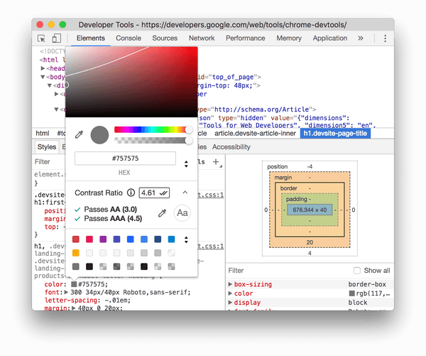
 input
. However, sometimes placeholders are being used in place of an actual HTML label
element. This is problematic for a few reasons:
label
element associated with the input
, some screen readers may not be able to convey the purpose of the input
.placeholder
text is removed from view, the context of the input
may be lost, forcing someone to remove the entered text in order to remember what the input
was for.input
.There are more issues with the placeholder
attribute, but with these few in mind, it's clear that placeholder
should not be used as a replacement for an actual label
.
The "floating label" technique seems to be picking up in popularity as of late. Depending on how it's implemented, the basic idea is to use CSS to position the label
(or sometimes the placeholder
) text over-top of the related input
element. When someone starts typing, the label
text is "floated" up and placed above the input.
The benefit of this approach is that it saves space in-between inputs when screen real estate is tight. There's also the clear benefit of a label
element being associated with its input
element for screen readers to convey the purpose of the input
.
The downside to this approach is a direct result of its purpose of being; when the label
is floated up above the input
, the space available typically only allows for less than ideal text size. This could result in difficulty reading the label text for anyone with low-vision. Of course, they could just zoom in on the screen, but why require creating more work for our users?
Then the other concern regards the actual implementation. If the technique ends up using the placeholder
attribute instead of an actual label
, it would result in issues previously discussed, mainly the lack of conveyed purpose when interacted with a screen reader.
The ideal design of form labels when it comes to accessibility is the "always visible" label. Just as it sounds, this technique features a text label that is always present across the whole experience of filling out the form.
The benefits of this approach are quite clear:
label
is always visible, requiring no cognitive load of having to remember the input purposeinput
when interacted with label text is large with ample white space to be readableWith all this in mind, it's strongly recommended to keep labels visible. Eliminate any guesswork required from your users and allow them to complete the task at hand with ease and confidence.
One more label type we need to discuss is the "visually hidden" label. These often appear in tiny, one-off form inputs such as Search or Language selector components where space is limited.
As we know, form input
elements must always include a label
in order to share its purpose with the user. What can we do when a design calls for a non-visible label
? Let's review how to apply a visually hidden label in two different ways, each method leading to the same outcome in the end.
Note: Voice dictation users may have difficulty finding the correct call-to-action when accessing each control with a visually hidden label. Proceed with caution.
.visuallyhidden
classApplying the .visuallyhidden
class definition (also sometimes called .sr-only
) directly to the label
element will remove the label for sighted users, but remain available for screen reader users.
<label for="lang-selector" class="visuallyhidden">Select a language</label>
<select id="lang-selector">
<!-- ... -->
</select>
aria-label
approachAnother option is to apply the aria-label
attribute directly onto the input
element in order to provide a "hidden" label.
<select aria-label="Select a language">
<!-- ... -->
</select>
Just like the .visuallyhidden
approach, this will provide a label
for the input
and, on input
focus, the aria-label
value will be announced by screen readers.
When only specific fields are Required or Optional to fill out a form, it's best to denote this requirement with visual and audible cues. This helps people to know which fields they absolutely need to fill in which, in turn, provides reassurance when filling out the form.
When marking as Required, this is typically done with an asterisk character or an icon placed beside the form label
. Whether you use the asterisk or some other form of an icon, what's important here is:
The placement of the icon is consistent throughout the form
The icon features a contrast ratio high enough to be visible (3.0:1
for non-text elements)
<label for="email">
Email
<svg
class="required-icon"
role="presentation"
aria-hidden="true"
focusable="false"
…
>
<!-- … -->
</svg>
</label>
When marking a field as Optional, placing this context as plain text within the label
will suffice.
<label for="email">Email (Optional)</label>
In order to notify a screen reader user of a required field, we can simply add the aria-required
attribute to the input
element. This will inform the user that this field is required, but does not add anything else in terms of field validation.
<label for="email">Email</label>
<input type="email" id="email" name="email" aria-required="true" />
When a screen reader encounters this input
, it may announce something like, "Email, edit text, required."
In addition to the visual cue for each required field beside the label
text, it's also best practice to place instructions at the top, notifying the user of each field type. Something along the lines of:
<!-- When marking as Required… -->
<p aria-hidden="true">* denotes a required field</p>
<!-- When marking as Optional… -->
<p>All fields required unless described otherwise.</p>
With this plain text note, people with cognitive impairments, older generations, or someone new to the internet will have less trouble with understanding which fields are mandatory, and as a result, spend less time and effort on filling out the form.
required
attributeNow, as a developer you may be thinking, "Why not just use the built-in HTML required
attribute? Doesn't this also announce a required field?"
It's true that including the required
attribute renders a similar result to using aria-required
, notifying the screen reader user of a required field. The difference is using aria-required
allows the developer to include custom validation rules.
Using custom validation instead of the built-in browser validation is strongly preferred for a few reasons:
For these reasons, it is strongly recommended to implement custom form validation.
This comes back to 3.3.2 Labels or Instructions which states:
"Labels or instructions are provided when content requires user input."
The design of form error messages can be quite delicate. The idea is to bring awareness to the current state of the form without being overwhelming. Unfortunately, it's very easy to cause frustration or grief when displaying error states, especially for those who aren't so tech-savvy and who are already very cautious and on edge from using a computer in the first place.
As designers and developers, it's our responsibility to ease our users into the systems that we create, guiding their way through the path we've set forth before them.
With this in mind, let's consider a design aesthetic which is informal and does its best not to be overbearing at the same time.
Three things to look at in this section include:
Error text is critical when conveying an error state. Without this text, people might not realize that the form is in a state in which it cannot be submitted. Sure, we could change the color of the input
element, perhaps alter its border
or background
properties to something recognizable as an error state. However, as we've already seen, relying on color alone to convey meaning is not ideal.
So, how do we ensure the input error state is properly conveyed? A few things we can do are:
When someone using a screen reader comes in contact with an input
element in an error state, this information needs to be announced alongside its label
text. Otherwise, there's a good chance the error context could be lost when navigating through a form.
There are a few ways to accomplish this, but the most robust would be to include the aria-describedby
attribute on the input
element. Adding this attribute places the error text in the "queue" of announcing the element on keyboard focus.
In order to programmatically make the connection, the aria-describedby
value needs to match the id
of the error text container.
For example, let's review an input
element in an error state.
<label for="fname">First name</label>
<input type="text" id="fname" name="fname" />
<span id="error-fname" class="error">First name is required</span>
This input
features a label
and some error text directly below. However, the text is not included with the announcement of the label
as there's no programmatic connection being made.
Let's make the connection using aria-describedby
, an attribute which is used to help provide more information for the given context.
<label for="fname">First name</label>
<input
type="text"
id="fname"
name="fname"
aria-invalid="true"
aria-describedby="error-fname"
/>
<span id="error-fname" class="error">First name is required</span>
With the aria-describedby
attribute applied to the input
, and its value matching the id
of the error text container, the announcement from a screen reader would sound like,
"First name, invalid, edit text. First name is required."
One of the benefits of using aria-describedby
specifically is that it adds a short pause in between the label
text and the error text, giving it a little bit of a distinction in the announcement.
Presenting a list of error when a form is in an error state is particularly useful on large forms. This content is made up of a heading, explaining the current state of the form, followed by an unordered link list.
The heading, typically an h2
element, is the primary method of bringing the error state to the users' attention. Sighted users will see the large text and non-visual users will have the keyboard focus be brought to this portion of the screen automatically using focus management; when the heading is presented to the user, send the focus to the heading element using the JavaScript focus()
method as well as applying tabindex="-1"
to the heading element in order for it to receive focus.
The list portion is made up of a ul
element containing links. Each link represents a single error in the form. The link text should match that of the error text output below the related input
. When activated, the keyboard focus would switch from the link to the related input
, allowing the user to focus on and address the issue at hand.
<h2 class="form-message__title" tabindex="-1">
Please adjust the following:
</h2>
<ul>
<li>
<a href="#fname" class="form-message__link">
First name is required
</a>
</li>
<!-- ... -->
</ul>
<!-- ... -->
<label for="fname">First name</label>
<input
type="text"
id="fname"
name="fname"
aria-invalid="true"
aria-describedby="error-fname"
/>
<span id="error-fname" class="error">First name is required</span>
The ideal positioning of the error list is directly above the form which is for user convenience. For example, if someone using a screen reader were to move forward past the error list, they would be brought to the form with its input
elements. Each input
would be accompanied by their own error state text which would inform the user on how to adjust the input
content to meet its validation requirements.
The error list, in combination with the error text below the input
, ensures the user is notified of the current errors which need attention and removes the cognitive load of not having to remember each error which needs fixing; the error message will be available when they arrive at the input
element.
This comes back to 3.3.1 Error Identification which states:
"If an input error is automatically detected, the item that is in error is identified and the error is described to the user in text."
Just as important, but sometimes forgotten about, is the success message. When someone completely fills in the form correctly, there should be text set in place to notify the user of the current state.
As with the error list heading, the success message should also be designed to include large, attention-grabbing text. In addition, the keyboard focus should be managed on behalf of the user and set on the success message heading element. With this, the user will be informed of the form submission and can confidently move onto another task.
autocomplete
attributeThe HTML autocomplete helps users to complete filling in forms by using data stored in the browser. This is particularly useful for people with motor disabilities or cognitive impairment who may have difficulties filling out forms online.
For example, a form input asking for someone's email address wound need to include the autocomplete
attribute in order to send a hint to browser or other user agents to query for this data:
<label for="email">Email</label>
<input type="email" id="email" name="email" autocomplete="email" ... />
With this in place, users will have a much easier and comfortable user experience when their browser of choice prompts them to enter their email address on their behalf.
Review the section, "W3C HTML 5.12 – 4.10.18.7. Autofill" for all other input types and their corresponding autocomplete attribute values.
In modern form design and development, especially common in SPA app demos, there are two trends in particular: inline-validation of form controls after they've been "touched" (essentially when the user moves away from the input
) and keeping the Submit button in a disabled state (via disabled
attribute) until each validation test has been satisfied.
When it comes to creating highly usable and accessible forms, particularly for people with disabilities, it is recommend not using inline validation. This pattern has the potential to cause the user a bit of confusion or frustration at times. Some examples illustrating this include:
These simple actions trigger the error message and the result can be quite irritating
During usability studies, people often grumble or curse out loud when error messages appear before they've even started filling out forms!
Additional accessibility issues appear when the user navigates away from a field; the error message is displayed visually but, typically, not to assistive technology. In order to hear the error message, the user needs to navigate backward through the form. This would be an unexpected required action to hear and understand the error state.
With the Submit button
set as disabled
by default, only after all of the form validation rules have been satisfied does the control become available for use. Having this pattern in place might lead to a confusing or frustrating user experience; there's no indication as to why the control would be disabled after filling in the form on first pass.
Consequently, disabled controls can present two additional challenges for individuals:
disabled
elements; screen reader users may not get a full picture of what is available in the interface, leading to feelings of uncertainty or self-doubt.To alleviate some of these potential pain points for users, its recommended to take a slightly different, hybrid approach. Consider making the following changes to your form workflow:
input
is in an error state, output the error message text as described previously. This will serve as a reminder of the error and the expected value when the control is navigated to, as well as any other controls in an error state when the user moves forward through the form content.input
, run the validation test. If the test fails, output the error text visually for sighted users but refrain from announcing the new state to screen reader users.input
which is in an error state, remove any error text; only display error text when focus moves away from the input
.button
enabled. This will allow the user to easily explore the form and become comfortable with the form structure on the first run through. Even if the form fields have errors, allow users to submit the form on their terms, when they feel comfortable to do so.With these changes in place, anyone relying on assistive technology or those who require a little more guidance in completing a form will have a clearer understanding of how the form is structured and the current state of the form, as well as if there are any errors and how to address them.
If there are changes to be made on submit, focus will be brought up to the error list. From there, error links will move focus directly to the form input
in question. From this point, error messages will be announced when traversing the form, and any changes to the data can easily be made with greater confidence on the part of the user.
For this same reason, using HTML list elements, in proper context, helps all users to consume content. Screen reader users have extra benefits as when encountering a list, the total amount of items is announced. WIth this, the user can choose to continue exploring the list items or skip past the list entirely.
Which types of content might be considered a list? Typically, a list would consist of a grouping of related content items, usually concise in nature. That said, here are a few examples of valid list content:
There are more examples which could be included in this list, but the idea to keep in mind is when content consists of a grouping of related items, chances are it should be a list. The question remains, which list element should be in use?
There are three different types of list elements in HTML. Each have their own semantic meaning and using them appropriately will go a long way with providing meaning to your content.
Here's a brief overview of each:
ul
; A listing of related content with no specific order. Use to add structure and meaning with navigation, blog listing page, carousel arrow controls, ect.ol
; A listing of related content which depends on a specific order. Use to add meaning to check lists, carousel items and bullet controls, etc.dl
; A listing of related pairs of content. Use to add meaning when defining terminology, an FAQ list, outputting regular/sale pricing, etc.This comes back to 1.3.1 Info and Relationships which states:
"Information, structure, and relationships conveyed through presentation can be programmatically determined or are available in text."
We all know SVG icons are fantastic for so many reasons (such as scalability, their ability to animate, and are able to flex and respond to a viewport's requirements) but how do we make sure they're accessible?
Let's take a look at a few different scenarios where SVG embedded within HTML might be used and how to ensure they are accessible for people using assistive technology.
Like images on the web using the img
element, we need to determine if an SVG is informative (its presence is worthy of adding content to the current context) or is purely decorative (adding a bit of eye candy for sighted users, but not important enough to warrant a text alternative.)
In the case of an SVG being informative, there exists a pattern which renders the SVG and its content consistently across modern browsers and screen readers. This pattern consists of three key items:
role
attribute applied to the SVG element itself, with a value of "img" – ensures assistive technology announces its role as, "image"aria-labelledby
attribute on the SVG with its value set to match the id
of the SVG title
element – ensures assistive technology consistently announces the value in the title
title
element with its content set to the accessible name of the SVG<svg aria-labelledby="icon-title" role="img">
<title id="icon-title">SVG image description</title>
<!-- Other required elements... -->
</svg>
With these items now in place, all browser + screen readers will accurately announce the SVG content as:
"SVG image description, image"
A few instances where this would be used include:
When the SVG is the only piece of content inside an a
or button
element, this pattern serves as the element's accessible name, giving context to the purpose of the currently focused element.
A decorative SVG exists only to serve as a visual aid for sighted users. In this instance we need to setup the SVG to be "hidden" from screen reader users as announcing the presence of a non-content item would only be a nuisance.
Just like its informative cousin, the decorative SVG requires a few extra attributes:
role
attribute with a value of "presentation" – helps to strip away any semantic meaningaria-hidden
attribute with its value set to "true" – hides the SVG from assistive technologyfocusable
attribute set to "false" – this helps to avoid an Internet Explorer bug where if the SVG were embedded within a focusable element, such as an a
or button
, it would cause an extra tab-stop to occur<svg role="presentation" aria-hidden="true" focusable="false">
<!-- Other required elements... -->
</svg>
With these attributes set in place, the SVG element will be completely removed from assistive technology.
A few instances where this would be used include:
When the SVG is alongside related text content, this pattern serves to remove the SVG from assistive technology, avoiding any unnecessary announcements.
It's not uncommon to have a design requirement be made to include an arrow or plus/minus imagery inside of a link or button. For reasons such as performance and including crisp imagery on a variety of devices and screens, this is usually accomplished by including an HTML entity character. However, in doing so, this pattern may have introduced an accessibility issue.
What issue, you may ask? Entity characters have their own, built-in semantics and accessible name. When a screen reader comes into contact with an entity character, it is announced like any other piece of text. Having the extra content announcement, however minor, could lead to a confusing user experience for some.
In the context of the example of adding an arrow icon to a button, the entity icon is purely decorative. In the same light as removing an alt
text value from an image that's been deemed as "decorative" in order to hide from screen readers, the same treatment should be applied to entity characters.
Let's review a few common techniques on adding an entity character and making sure it is ignored by assistive technology.
A common CSS pattern for including an arrow styled icon within a button
element is using a CSS pseudo element. The following code should achieve what we're looking for:
.btn--continue:after {
content: ' →';
}
This code will add the arrow icon to each instance of the matched selector, however, the character will be announced by a screen reader. This is not ideal. (There were plans for the CSS3 specification to allow CSS to hide content from assistive technology. Sadly, work on the CSS Speech Module has been discontinued.)
Let's review another pattern, placing the arrow icon directly within HTML:
<button class="btn btn--continue">Continue →</button>
Again, this code will add the arrow icon to each instance of the button element, however, the character will be announced by a screen reader.
aria-hidden
The method of making an entity icon hidden from screen readers and other assistive technology, ie., setting it as decorative, is to wrap the icon itself with an aria-hidden
element.
<button class="btn btn--continue">
Continue
<span aria-hidden="true">→</span>
</button>
With this in place, the arrow icon will be ignored by assistive technology and only the vital information of, "Continue" will be announced.
Emoji are a great tool for quickly expressing an emotion or action via icons. However, when it comes to emoji's and accessibility, what's displayed visually may not come across the same for someone using assistive technology.
Take for instance the common phrases, "I ❤️ you" – announced as, "I red heart you." This isn't exactly the correct meaning behind this message. Let's make this emoji more friendly to screen reader users.
In order to render the content as one may expect, we can wrap the emoji character with an HTML container element and add some attributes:
span
element since it has no semantic meaning and is styled inline by defaultrole
attribute, setting its value to "img" in order to announce the emoji as an imagearia-label
attribute, setting its value to the expected text to be announced (this is similar to setting an alt
attribute on an actual image element)<p>
I
<span role="img" aria-label="love">❤️</span>
you.
</p>
Now with this setup, screen readers will hear the message as intended!
From a usability perspective, using icons and text together provides the most context for people to understand iconography. For some people, being able to recognize a consistently used icon is a quick way to gain context. For others (including people who might be using translation tools) text can be more helpful. For people with reading disabilities, the combination of text and icon can help reinforce concepts and provide reassurance. Icons that represent literal concepts or objects are always clearer than those that represent metaphors.
When using informative icons, always consider what text best describes them. Use the same text consistently in order for people to always understand the meaning of the icon. Icons should only be used alone when they represent a concept that is universally understood in the system. If an icon is used alone, a text equivalent is still needed for people who rely on screen readers or other text to speech tools.
In other words, how readable is text against its background? If the contrast is low, people will have greater difficulty with reading the text. On the other hand, a higher contrast will allow for easy reading.
In regards to web accessibility, color contrast is the #1 offender on the web when it comes to accessibility issues. Unfortunately, it seems as though modern design overlooks this issue and often includes text which is only readable by those who have strong enough vision to do so. Colors like grey on black, light grey on white, etc. These color combinations, as well as a host of others, can be very difficult for some people to perceive.
In order to be more inclusive with our color choices, let's look at how we can test our colors to make sure they're readable by as wide an audience as possible.
When it comes to choosing which colors to use for your design, there is a specific number, or contrast ratio, to reach for. This threshold has been determined by the W3C as a way to ensure people with low vision are able to read text content.
The threshold breakdown is as follows:
Object | Ratio |
---|---|
Text and images of text | 4.5:1 |
Large text (greater than 18pt ) |
3.0:1 |
Non-text (borders, icons) | 3.0:1 |
As displayed here, the threshold is more forgiving for larger text and non-text content, such as input borders and icons. However, we still need to ensure these elements are also highly visible.
Now that we know what to watch for and which ratios should be used to test which type of content, how do we actually test the contrast ratio of our colors to ensure readability?
We have available to us quite a number of color contrast testing tools. Some are more automated than others; which one you use might depend on your current need.
Here are a few contrast ratio tools to consider:
This comes back to 1.4.3 Contrast (Minimum) and 1.4.11 Non-text Contrast which state:
"The visual presentation of text and images of text has a contrast ratio of at least 4.5:1."
"The visual presentation of User Interface Components and Graphical Objects have a contrast ratio of at least 3:1 against adjacent color(s)."
When it comes to relaying messages to the user, especially something important such as an error or success state of a form, how much time is left to complete an exercise, or sections of a pie chart, it's best to not rely on color alone to convey this information. People with low vision or color blindness may have a difficult time understanding the content.
There are different types of color blindness and low-vision impairments which makes perceiving specific colors difficult or impossible. With this in mind, to help convey this important information, it's ideal to include other visual indicators such as:
With these extra visual affordances, people with color blindness, low-vision, or perhaps even a cognitive disability will have greater success in using and completing various tasks on your site or app.
This comes back to 1.4.1 Use of Color which states:
"Color is not used as the only visual means of conveying information, indicating an action, prompting a response, or distinguishing a visual element."
The header with a mega-nav dropdown which opens on keyboard focus, a search form, a left side content area… what a headache! If only there were some way to skip all of this repeated content to get to what you actually want; the main content of the page.
Enter the skip link. The skip link is a link which is typically found at the very top of the HTML document, the first thing available when using a keyboard. Its purpose is to solve the issues described above; skip/jump/ollie over the repeated content areas in order to set keyboard focus onto the main body content. This way, keyboard-only users have a mechanism to go directly to the main content.
There are specific requirements in order to create a skip link:
href
attributehref
attribute to match the id
of the element which will receive keyboard focusvisuallyhidden
CSS class in order to hide the link visuallyfocusable
CSS class in order to show the link when it receives focus (this helps sighted keyboard-only users know where they currently are in the document)The code should look something like this:
<body>
<a href="#" class="visuallyhidden focusable">Skip to content</a>
<!-- ... -->
</body>
With the skip link in place and ready to go, the last requirement is providing a place for the link to anchor to; what do we set as the link's href
value?
The other part of creating a skip link is to send keyboard focus to somewhere useful. Remember, the purpose of the link is to skip over repeated content in order to provide quick access to the main content area.
Typically, when the link is activated, the focus will be sent to an element such as the main
element container or perhaps a heading element. These elements are not able to receive keyboard focus by default so, in order to accomplish this, the tabindex
attribute needs to be added to the element. Specifying a value of -1
will allow the element to receive focus, but will not be available in the natural tab order when navigating around the page using the keyboard.
With this in place, activating the skip link will bring keyboard focus from the very top of the document, past all the repeated content, and directly to the main
element. From this point, the user is able to Tab
forward and consume the primary content of the page.
The final code should look something like this:
<a href="#main" class="visuallyhidden focusable">Skip to content</a>
<!-- ... -->
<main id="main" tabindex="-1">
<!-- ... -->
</main>
Give it a shot using only your keyboard. If the link appears on focus and shifts to the main element, you're good to go!
This comes back to 2.4.1 Bypass Blocks which states:
"A mechanism is available to bypass blocks of content that are repeated on multiple Web pages."